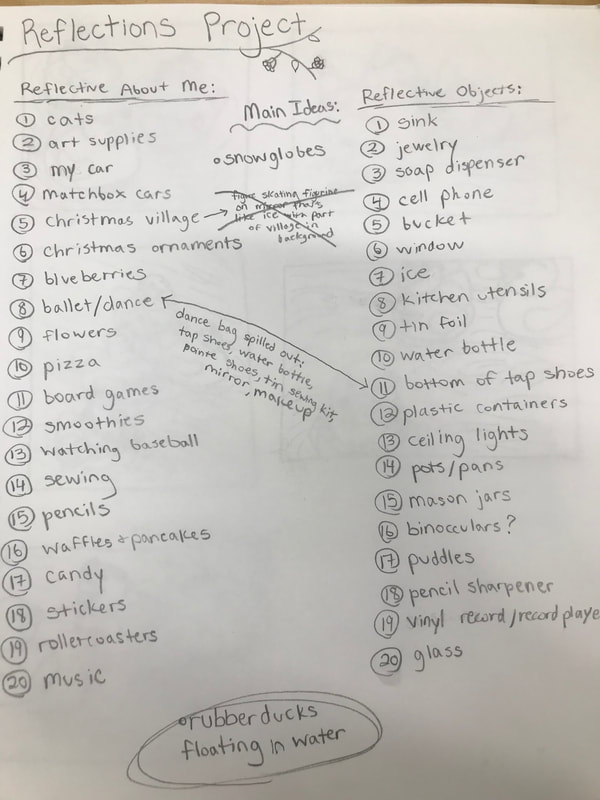
Art 4 Reflection
This semester was interesting. I think I grew a lot. I think my painting abilities in particular grew. In past art classes I've struggled with paintings. For some reason, when I paint I have the tendency to lose patience and rush. The paintings I did this semester I took care to maintain my patience and I think it shows. I was able to use oil paint for essentially the first time in the oil practices and the landscape. I want to continue to use oil in the future and get better at it and try more techniques. At some point I think that it would be fun to do a full palette knife painting. Another painting that shows a lot of growth is my self-portrait. I think that it's both the most successful acrylic painting and the most successful portrait I've ever done. In the past I've been kind of bad at acrylic painting and I didn't like using acrylic, but after doing this piece I feel more confident in my abilities and want to further explore acrylic as a medium. This piece was also successful as a portrait. While it has room for improvement, it looks just like me. The entire time it was on display in the hallway, people were constantly asking me about it, was it definitely me, did I do it, etc. I think that I also had a decent amount of growth in other mediums and subject matters. The ordinary to extraordinary project was the first time that I have done a piece in colored pens and markers. It also gave me room to try a more out-of-the-box subject. The interesting interior project was the first time I've really drawn glass realistically. I think choosing to do white prisma on black paper was a good choice, but in the future beyond this year I want to try some colors or maybe try painting glass. I think that after this semester I am better prepared to do my portfolio pieces. While next semester seems like it will be a little stressful and I'll have to work more quickly, I think that it will also include further growth as an artist for me.
Oil Landscape
|
|
|
Reflection:
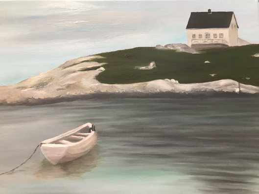
This is my first ever oil landscape. This scene is from a trip I took to Canada. It's somewhere around Nova Scotia. I like that this photo has water, rocks, and man-made things all in one. I started with the sky and the water. The water was difficult. I kept blending it too much. Then I worked on the land. I used my palette knife some to do the rocks because when I used my brushes the colors blended too much and I couldn't get the texture. Getting the details of this piece was difficult. I think I used brushes that were too large. I had to keep painting over different places because I kept making mistakes when trying to do small things. I still had to leave out a lot of details. I also strayed from the photo. I like my colors. I repeated a lot of the same colors throughout. They're also more mellow than what I usually use. I don't like the boat. Something about it is off to me. I think the shape is kind of strange and I think it's a little too smooth. Overall this piece is okay. It gave me valuable experience with oil painting.
This is my first ever oil landscape. This scene is from a trip I took to Canada. It's somewhere around Nova Scotia. I like that this photo has water, rocks, and man-made things all in one. I started with the sky and the water. The water was difficult. I kept blending it too much. Then I worked on the land. I used my palette knife some to do the rocks because when I used my brushes the colors blended too much and I couldn't get the texture. Getting the details of this piece was difficult. I think I used brushes that were too large. I had to keep painting over different places because I kept making mistakes when trying to do small things. I still had to leave out a lot of details. I also strayed from the photo. I like my colors. I repeated a lot of the same colors throughout. They're also more mellow than what I usually use. I don't like the boat. Something about it is off to me. I think the shape is kind of strange and I think it's a little too smooth. Overall this piece is okay. It gave me valuable experience with oil painting.
Oil Practice
|
|
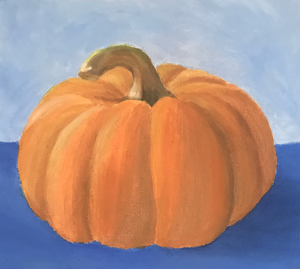
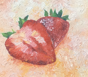
These are my practice oil paintings. The pumpkin is regular and the strawberries are done in palette knife. For the pumpkin it was difficult to not overblend. Using the palette knife on the strawberries was fun. I've used oil paint before, but I didn't entirely know what I was doing and I've never done palette knife before so this was mostly new to me.
|
Ordinary ⟿ Extraordinary
|
Brainstorming:
|
Planning:
|
In-Progress:
|
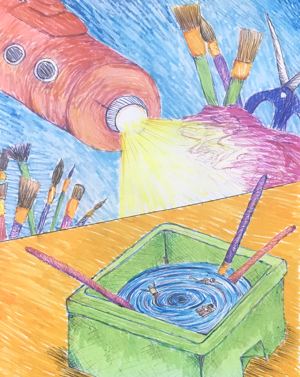
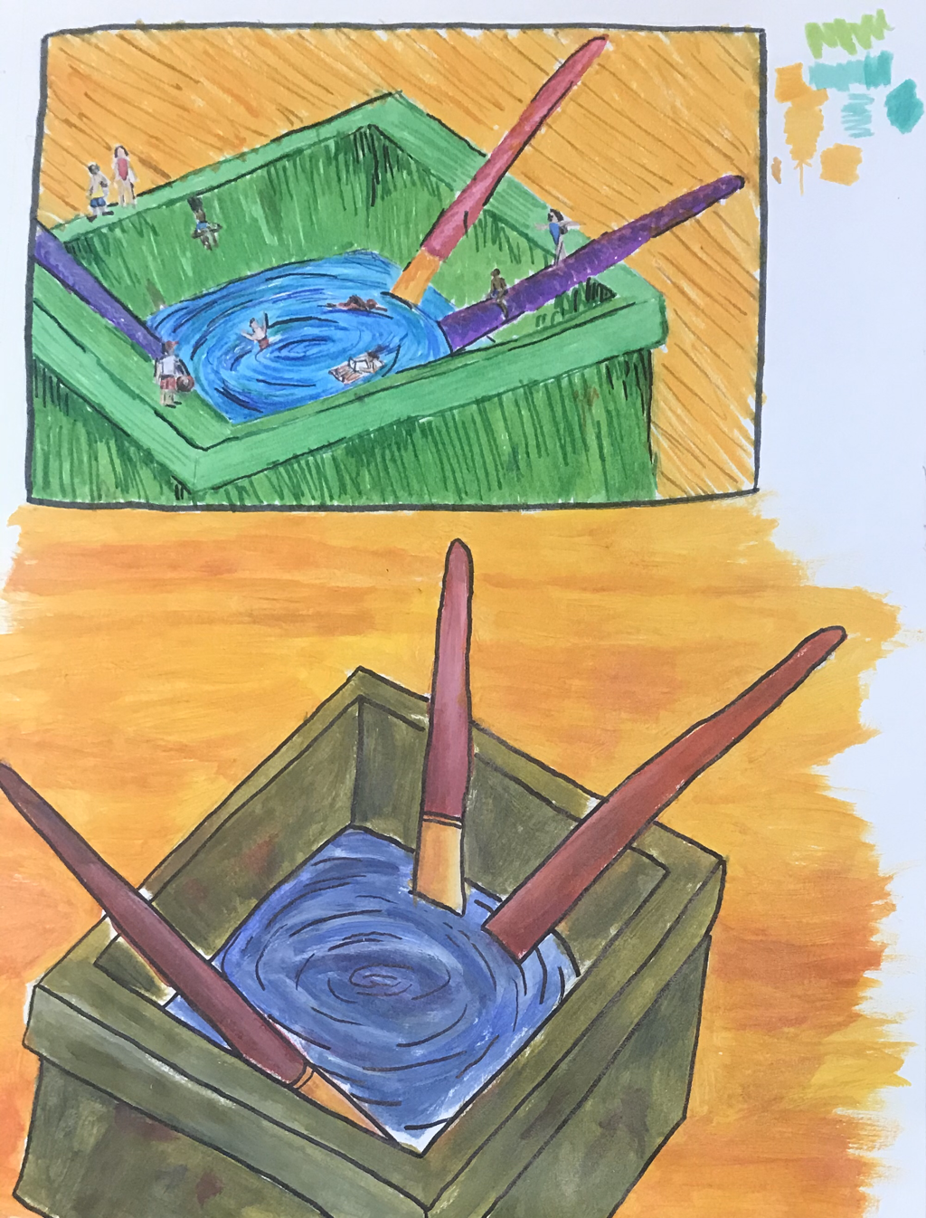
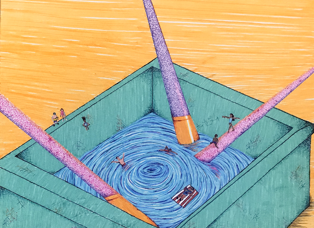
When I first started this I had two main ideas: turning a paint bottle into a submarine travelling through art supplies, and turning a water basin into a swimming pool with little people. These were both inspired by the classroom around me. After I decided to do the water basin I experimented with some different mediums and compositions in my sketchbook and added some more people from my original sketch. Through this I decided to do this piece in pen and marker on illustration board in a kind of cartoon style. I wanted vibrant colors and I wanted to be able to do small details. Because of all the little details this took a decent amount of time to complete.
|
Final:
|
Reflection:
I have mixed feelings about this piece. I like the idea that I chose; I think it's relatively creative. I also like the really bright colors. I like the way the water looks. I wish it was neater. There's a ton of small imperfections everywhere in this piece and they bother me a lot. The different techniques and textures in the water, brushes, and basin kind of clash. The texture that's created from the cross-hatching pen in the brushes looks kind of strange next to the smoothness of the marker in the basin and the background. I also think that it's a little juvenile and flat. Maybe I should have used a different medium. Or the same medium in a different way. I also don't like the amount of space in the background. Overall I think that this could have been more well-crafted.
|
Interesting Interior
|
Ideas, Reference Photos, and In-progress:
|
|
Reflection:
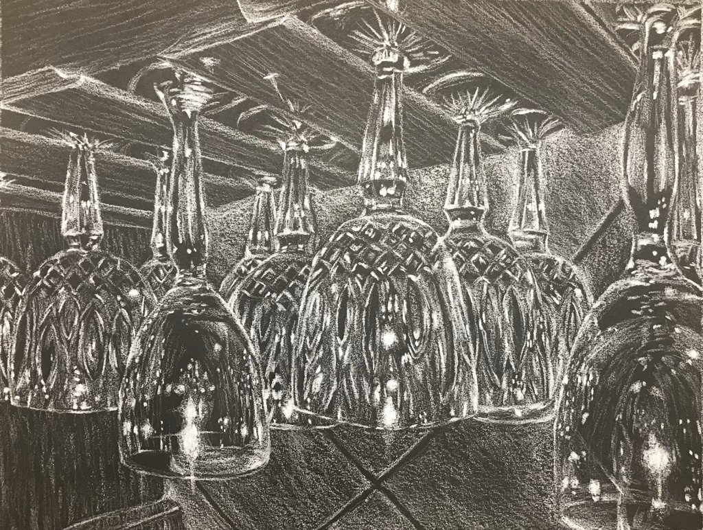
My interesting interior is a cabinet in my kitchen that has drink glasses hanging down. I didn’t really want to do this subject because I thought it would I would be really bad at drawing glass but it turned out okay. I chose to do it in prisma because the glass is really detailed and I thought prisma would work best for that. I was also originally going to do it in color, but as I filled in the whites first I decided that I liked the way it looked without color. I've never drawn glass, so I was a little worried about doing this. It was hard to keep the glasses consistent. Getting the fine details was also difficult. The glass to the far right was the most difficult because other glasses were visible through it and reflecting on it, which is hard to draw. It was also hard to make the bright whites, as the white colored pencil didn’t get that bright. I had to use a lot of pressure. Like all art, it could be better (neater, a little more realistic, etc.), but I think it's relatively well-crafted and I like the composition. I wish that I made it larger, as it’s kind of small. I feel like if it was larger it would be more eye-catching and I could have put more details.
My interesting interior is a cabinet in my kitchen that has drink glasses hanging down. I didn’t really want to do this subject because I thought it would I would be really bad at drawing glass but it turned out okay. I chose to do it in prisma because the glass is really detailed and I thought prisma would work best for that. I was also originally going to do it in color, but as I filled in the whites first I decided that I liked the way it looked without color. I've never drawn glass, so I was a little worried about doing this. It was hard to keep the glasses consistent. Getting the fine details was also difficult. The glass to the far right was the most difficult because other glasses were visible through it and reflecting on it, which is hard to draw. It was also hard to make the bright whites, as the white colored pencil didn’t get that bright. I had to use a lot of pressure. Like all art, it could be better (neater, a little more realistic, etc.), but I think it's relatively well-crafted and I like the composition. I wish that I made it larger, as it’s kind of small. I feel like if it was larger it would be more eye-catching and I could have put more details.
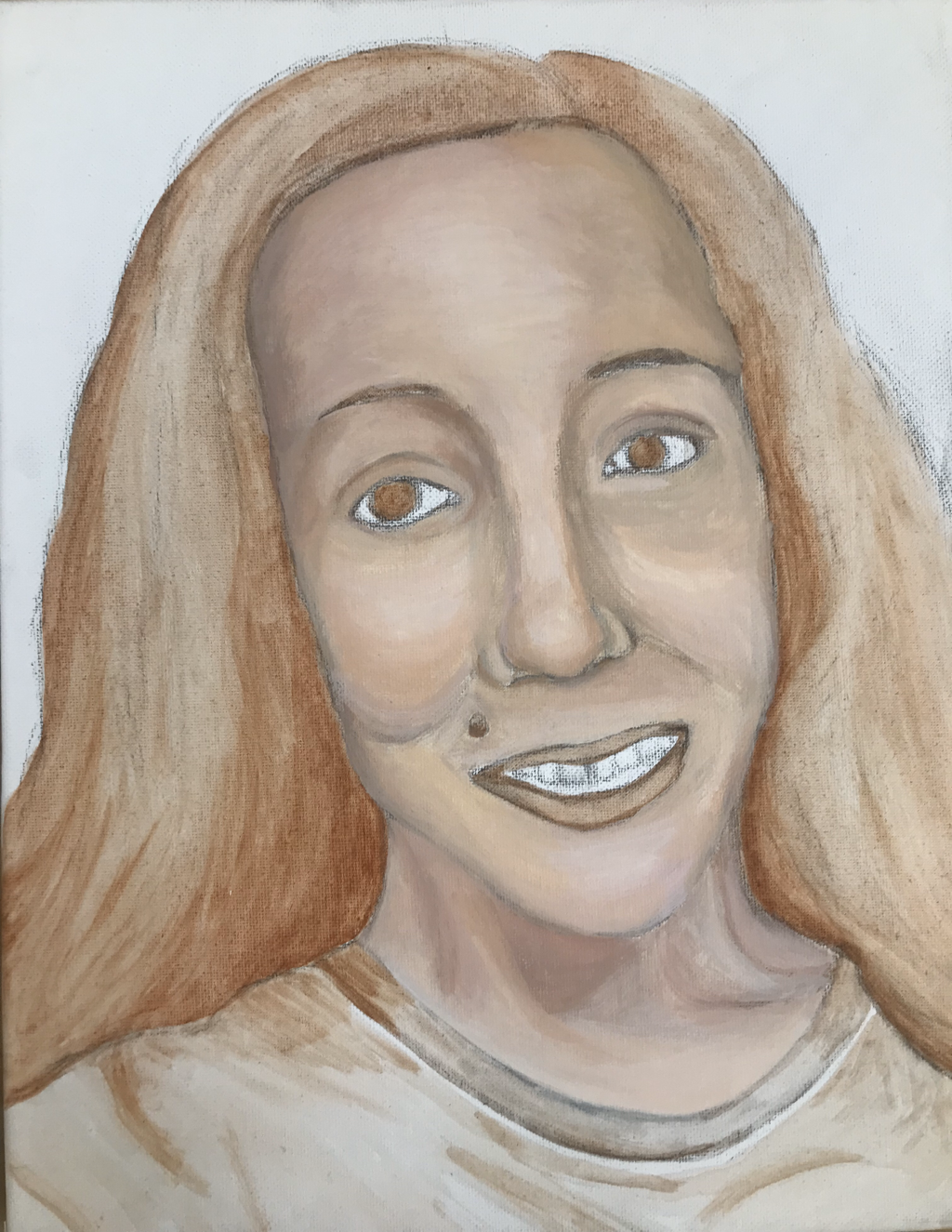
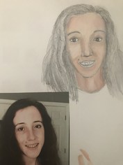
Self-Portrait Final
|
Reflection:
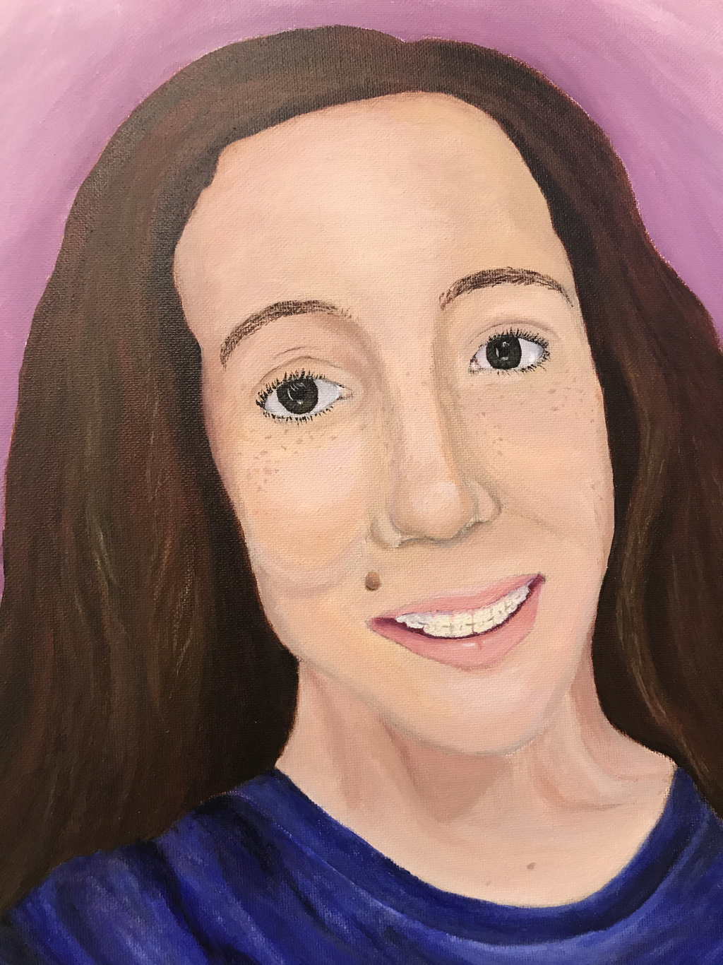
I'm usually kind of bad at portraits and paintings, but this looks relatively nice. I looked at my self portraits from Art 2 and Drawing and this one is by far the best. I’ve come a long way when it comes to doing facial features. I think that this looks like me and I matched the colors relatively well. I think the mouth and the fabric of the shirt are the best parts. For both I put down a lot of layers and mixed in a lot of colors. For the shirt I originally marked it out with purple, red, green, and different shades of grey before going over it with blue. For my mouth I started by blocking it in with dark purple. From there I created the lips by putting down layers of magenta mixed with my flesh tones and then I added some highlights with white. I made the background lavender on a whim and it looked okay with the other colors so I left it. I could have added more shading on my face and more highlights in my hair to create more depth and make it more realistic. I guess I could still go back and do that but I feel done with this piece. One of my eyes and some of the proportions are slightly off too. Overall I think that this piece shows a lot of growth. |
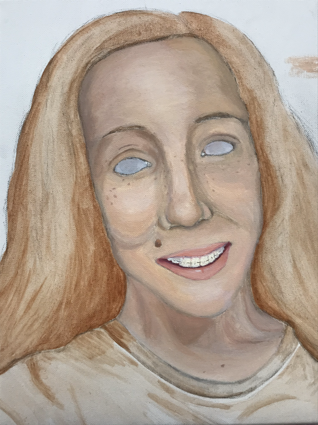
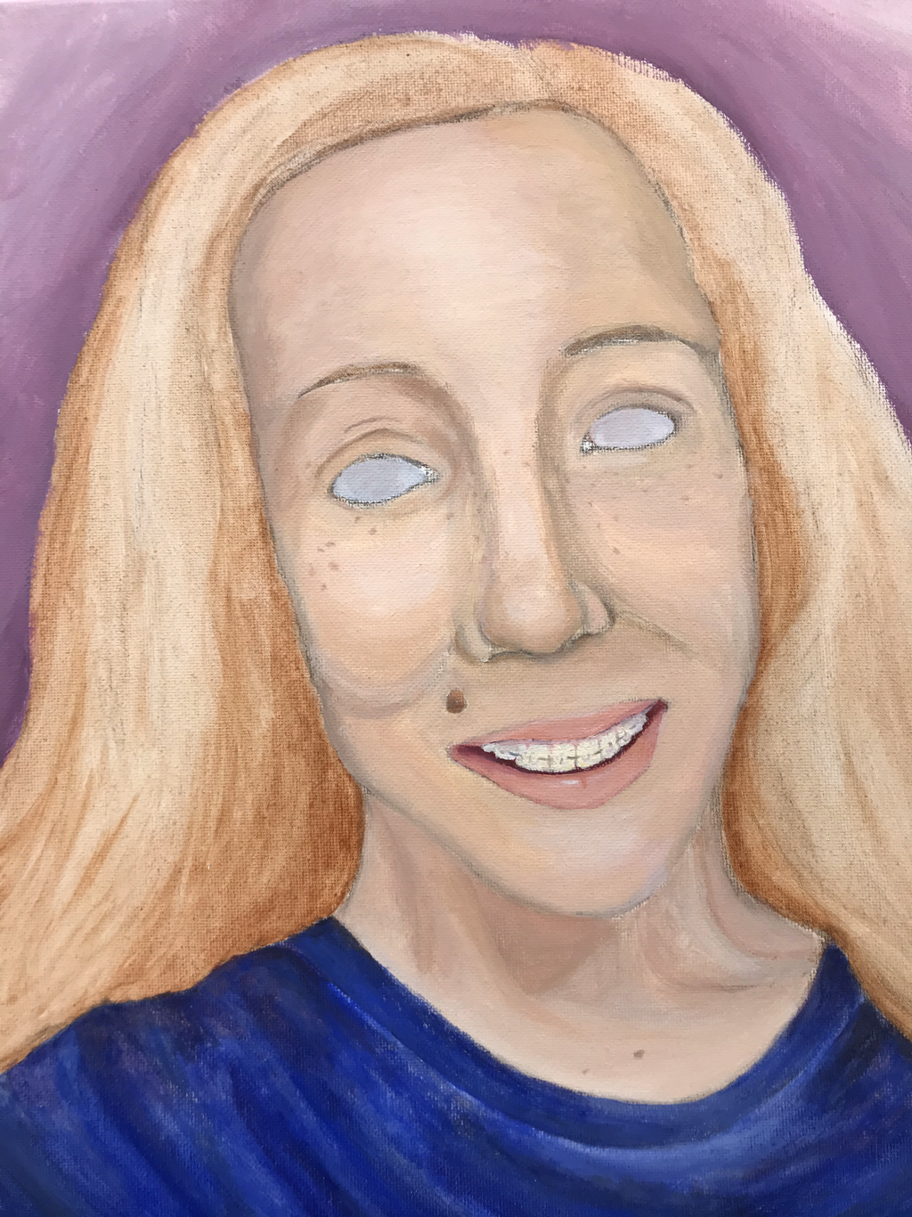
Self-Portrait Progress Photos
|
|
|
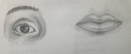
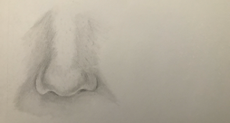
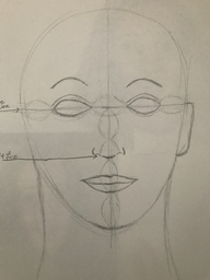
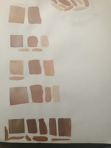
Preparing for Self-Portrait
Facial features practice, face placement, practice portrait, and skin tone swatches:
|
|
|
|
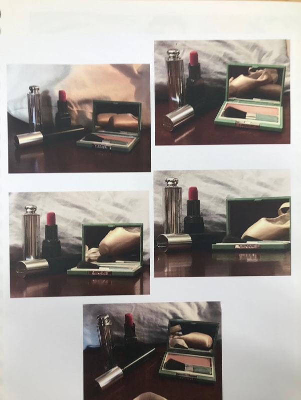
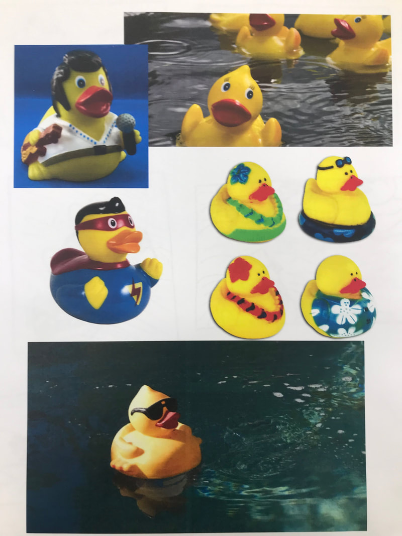
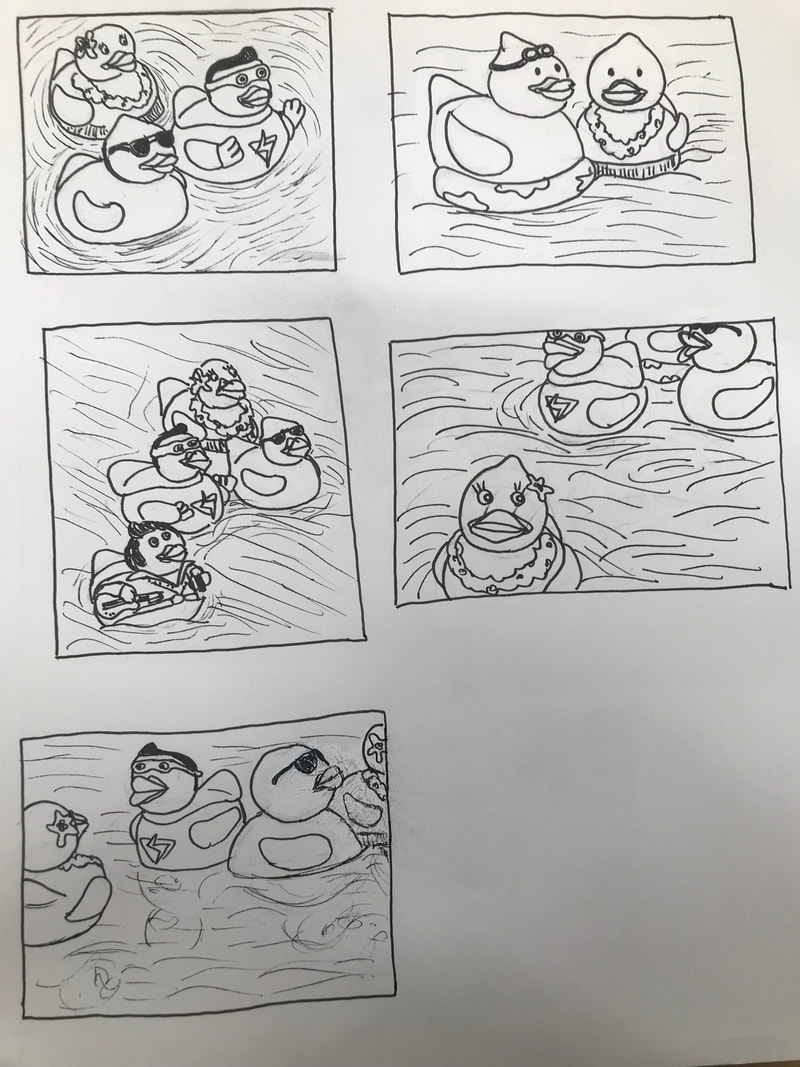
Representational Reflection
Ideas, Reference Photos, and Composition Sketches:
|
|
|
|
|
Final Sketch:
In-progress Photos:
|
Reflection:
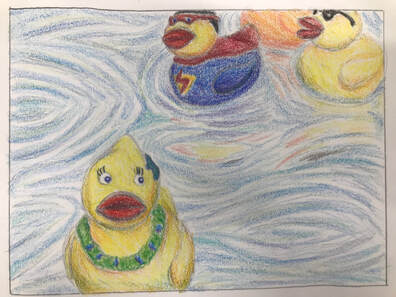
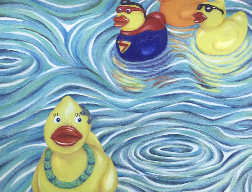
I saw that the Bubba Gump's in Charleston is closed and it made me think of going there during vacations when I was younger and racing rubber ducks with other kids. I went online and looked up different types of rubber ducks to decide which ones I wanted to include and it brought back even more memories, so I tossed out my other idea with the makeup. When I started my final I chose green paper because I thought the water would look nice on green but I was worried that the yellow of the ducks would come out strange and I would have to switch paper. The yellow ended up looking nice so I continued on the green. Drawing the ducks was the easiest part of this project. Drawing the water was more difficult. I decided I wanted to make a lot of swirls (to make it interesting) which I didn't have a reference for, so it could have easily gone wrong. Making the ducks' reflections was probably the most challenging part, especially since reflection was the main purpose of the project. It was hard to blend them in with the water and make them look like reflections, but I somehow succeeded. I'm really happy with this piece. I like the subject, the composition, the colors, and I think it's overall well-crafted.
Final:
|
Prismacolor Fruit Drawing
|
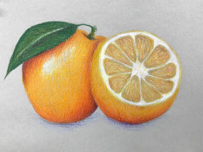
This is my prismacolor fruit drawing of an orange. I haven't used prisma in a while so it was good for practice. I used purple to create the shadows and that worked well. The shape of the orange is a little strange, but the focus of this was color. Overall this looks nice, especially for a quick warm-up drawing.
|
