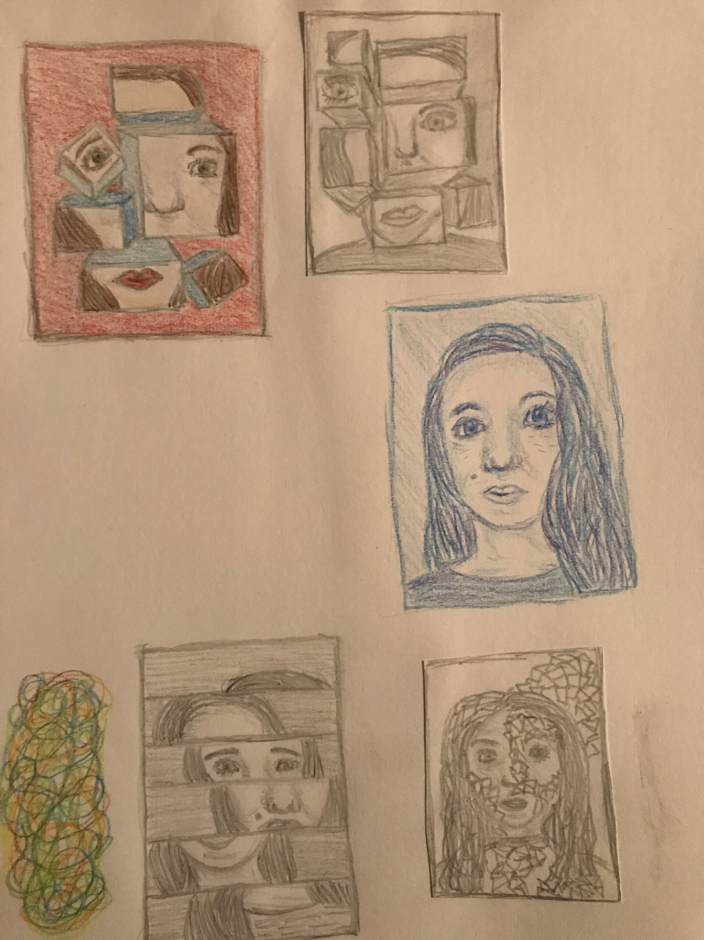
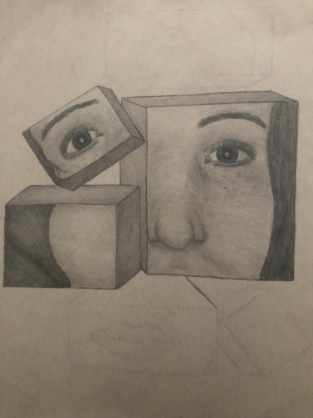
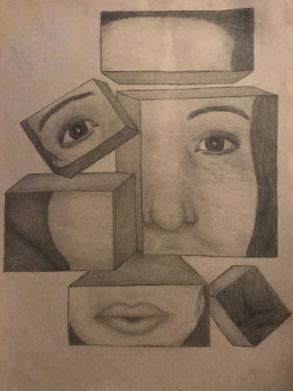
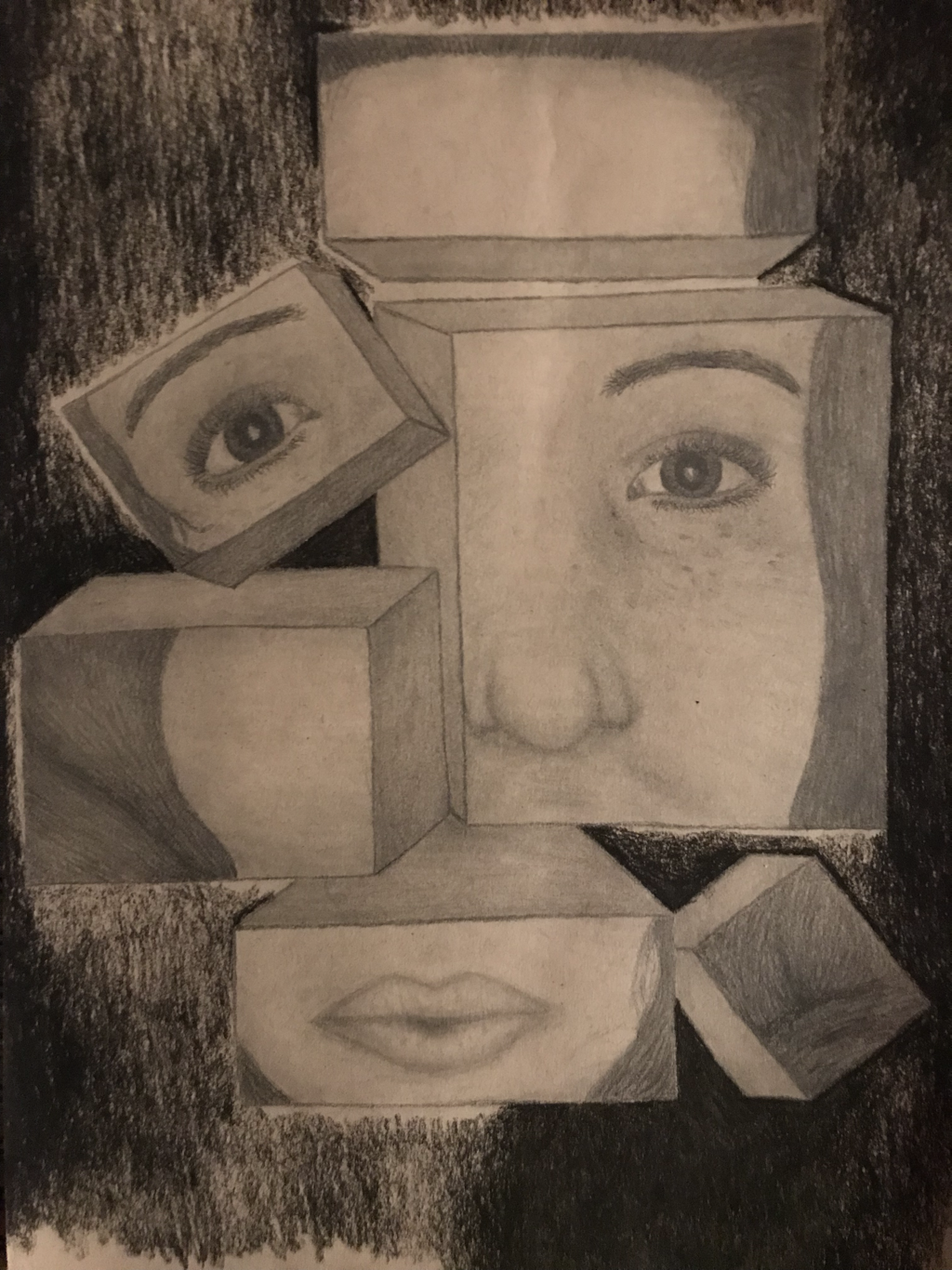
Self Portrait
Ideas and In-Progress Photos:
|
|
|
|
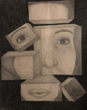
Final Artwork:
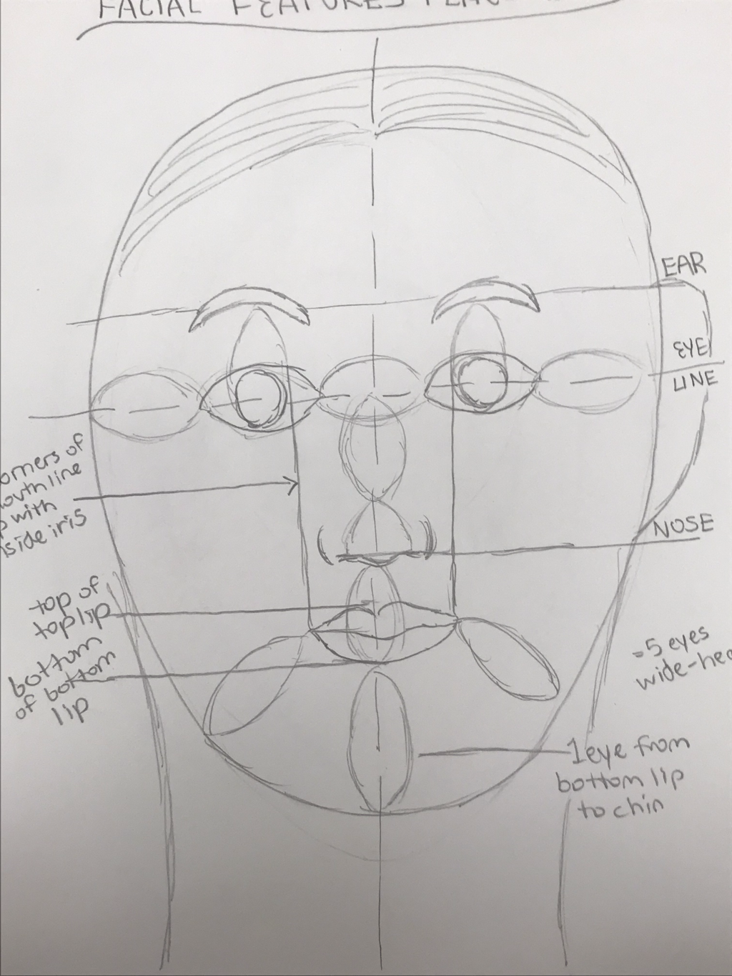
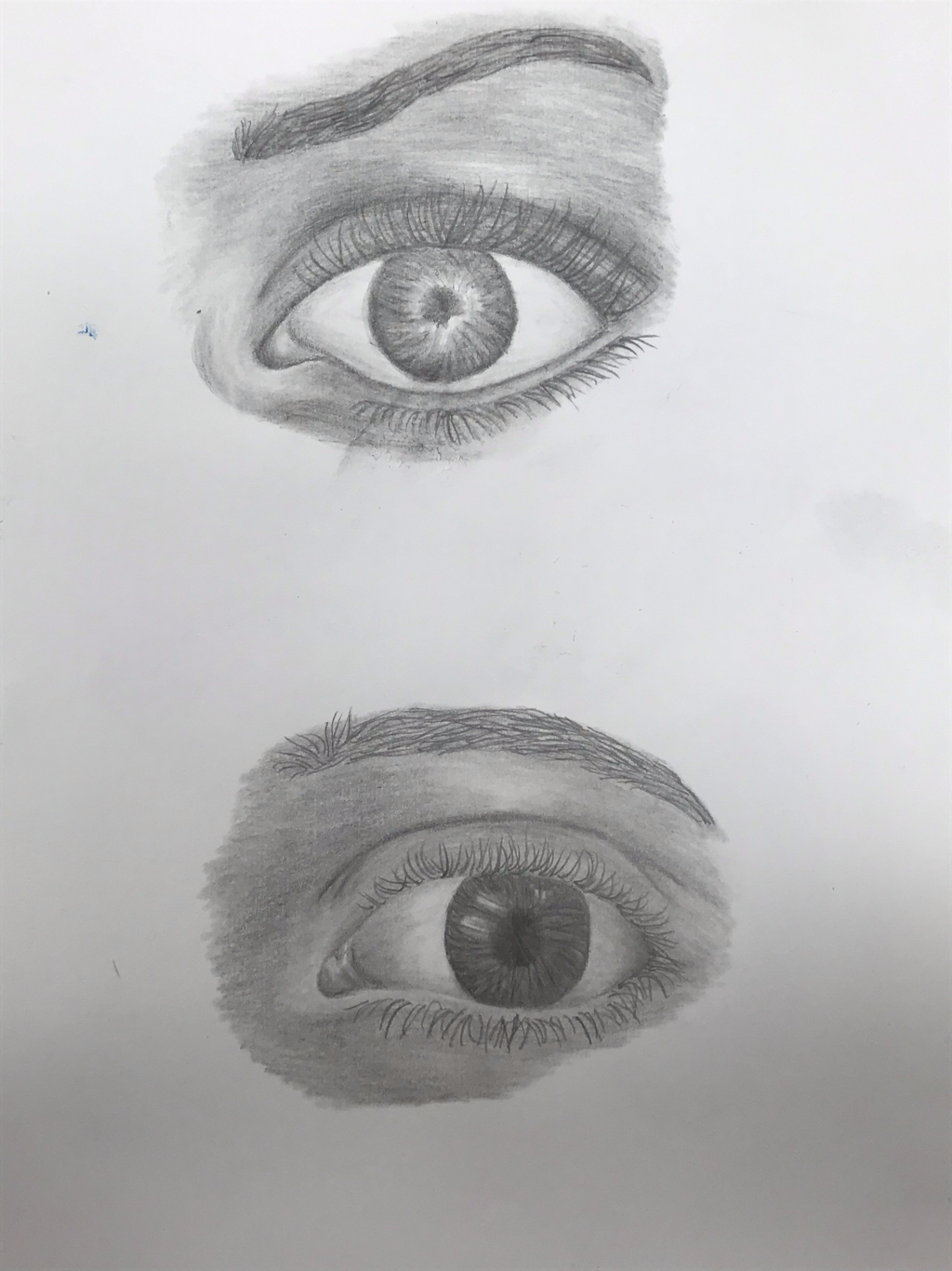
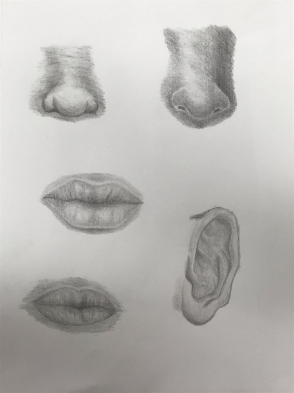
Facial Features
|
|
|
These are my practice facial feature drawings (placement, eyes, noses, lips, and ear). Faces are difficult and it's really easy for them to look off.
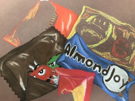
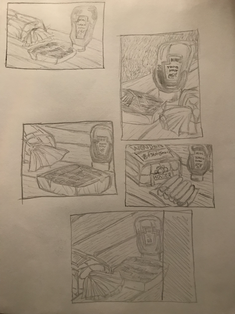
Candy Drawing (WIP)
|
This is my drawing of candy. This was kind of difficult to complete. Getting the logos and M&M people correct required precision and its difficult to be precise with pastels. Matching up the colors was also difficult, especially since the yellow pastel didn't blend as nice as the others and created a weird texture. Making the wrappers look like wrappers was challenging too.
|
Opacity Critique
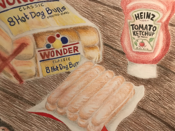
- Describe the craftsmanship of your drawing. My drawing is relatively well-crafted. It could have been neater and more realistic. Overall I could have created something better than what I did.
- Describe how your background choices help unify the three artworks and tie them together as one piece of art. I'm not sure how this question relates to the project we were assigned. My piece just happened to have three main objects, so I'll describe how I tried to create unity among them. I tried to arrange them in a balanced way and incorporate some of the same colors in all of them.
- Describe your choice of colors/color harmonies and how you used them throughout the artwork. I
- How did you create contrast in your drawing? I created contrast in my drawing by
- How did you use textures, highlights and shadows to enhance your artwork?
- Why did you choose a particular background color to your artwork? I did this piece on tan paper, kind of on a whim because I used it for the previous project and I thought this project would also work on tan paper.
- Discuss the importance of understanding the media (prisma) and acquiring the skills necessary to create a successful project.
- Describe any difficulties you had creating your drawing and what you could do to improve your drawing? I procrastinated a lot when creating this and in the end I had to rush to finish it, so it doesn't look as good as it could. Also creating opacity was difficult.
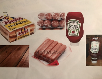
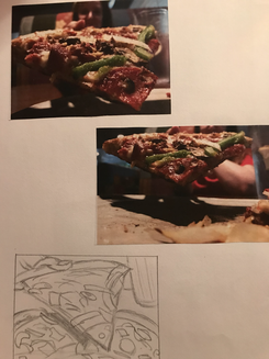
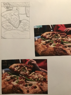
Opacity Project Ideas, Composition Sketches, Reference Photos, Final Sketch, and In-Progress Photos
|
|
|
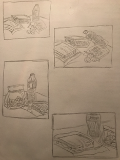
|
|
|
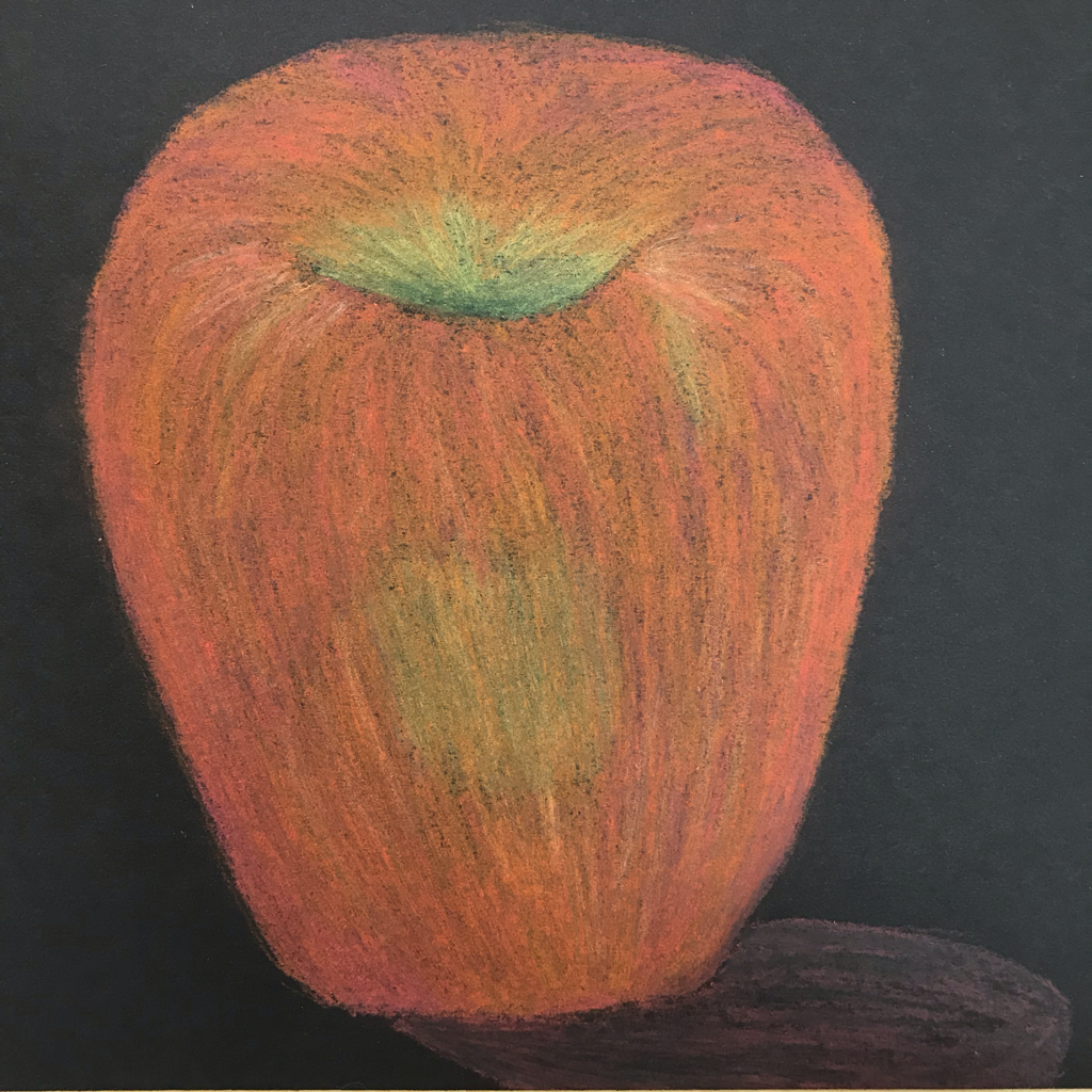
Pastel Apples
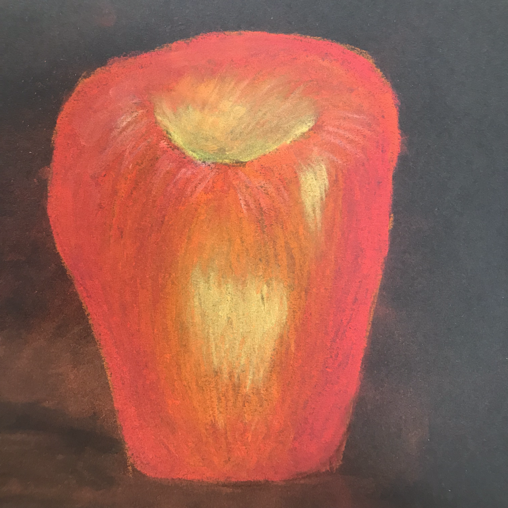
|
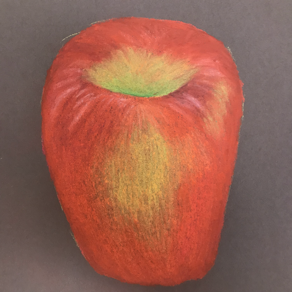
|
|
These apples were done using ordinary low-quality pastels, Prismacolor pastels, and pastel pencils. The Prismacolor pastels were my favorite, as they blended nicely without smudging, and they have a vibrancy that the pastel pencils lack.
|
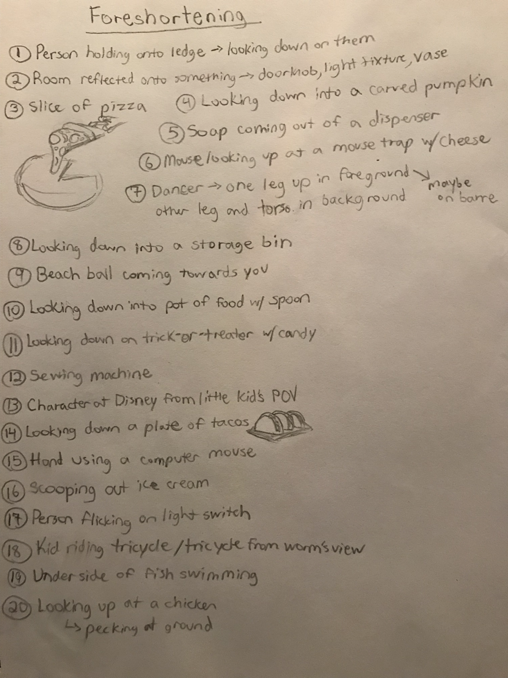
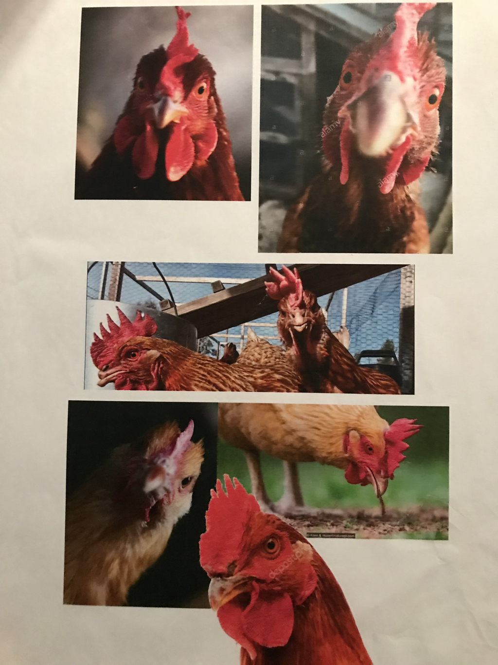
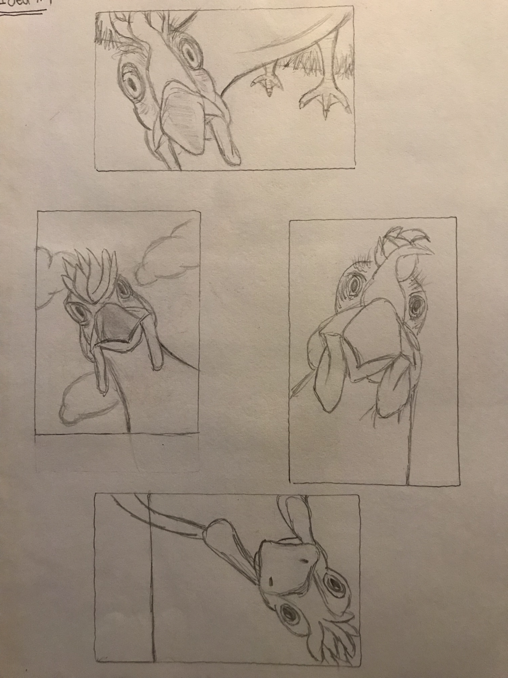
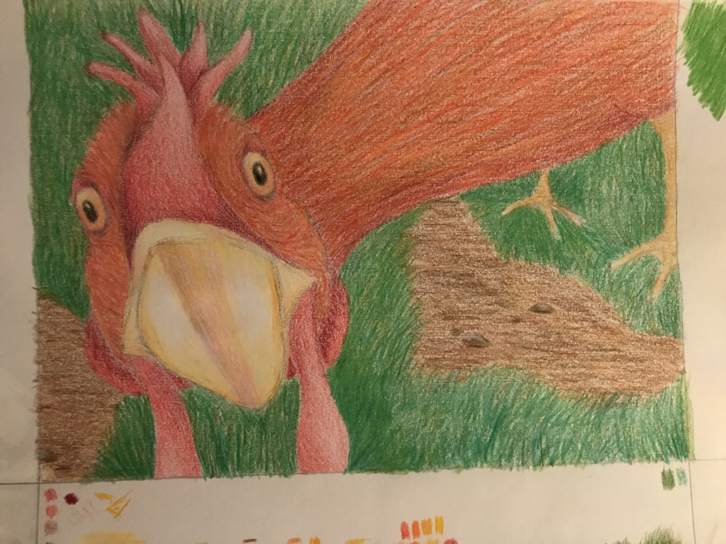
Look At That View
Brainstorming, Reference Photos, Composition Sketches, and Final Sketch:
|
|
|
|
|
|
In-Progress Pictures:
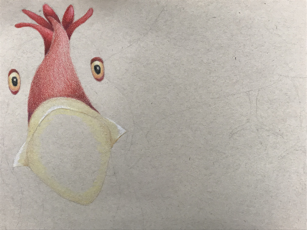
|
|
|
Critique:
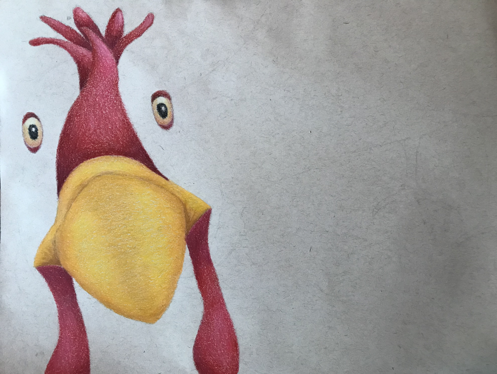
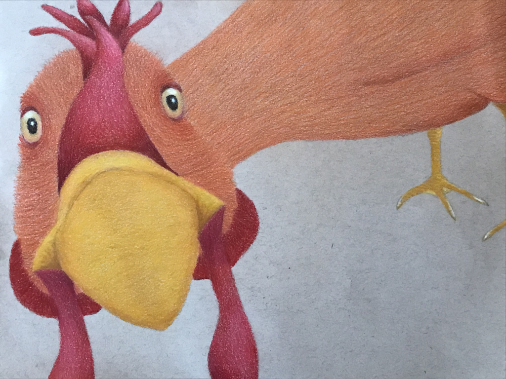
- Describe how you created an interesting point of view? Was it successful? Why or why not? I tried to create an interesting point of view by putting the chicken's face in the foreground and making it large so as to be up close to the viewer, and it's body smaller and less detailed in the background. It's successful in that the interesting point of view is obvious, however in the process of creating this point of view, the angle of the body became off and some of the proportions became strange, giving the overall piece a weirdness about it.
- Why is it important to understand perspective and how to draw it? It's important to understand perspective because, whether or not you notice it, perspective is a part of most compositions. In order to develop a good quality piece with a good composition, especially to create depth and capture the relationship between various things in a drawing, you need to have an understanding of perspective, even if you don't consciously think about it.
- How were the colored pencil exercises important in the success of your piece? The colored pencil exercises enabled me to practice how to blend colors and how to apply pressure to create the colors and textures that I wanted. These skills are important in creating a successful drawing using colored pencil.
- Describe the craftsmanship of your colored pencil. What techniques were used? This drawing is relatively well crafted. I layered my colors and applied even pressure. There's no stray lines or places with really uneven shading. I could have made my proportions better. I also could have created more depth, however this is something that I can still go back and improve.
- Were you able to achieve depth by showing a foreground, middle ground and back- ground? I created some depth. The face of my chicken is clearly in the foreground and the body is in the background, however there's very little in-between and I could have exaggerated my proportions more to create more depth and truly create an interesting point of view.
- Explain your experience with colored pencil and the project in general. What were the obstacles and advantages? Colored pencil is good for creating vibrant colors and showing contrast. A lot of layers are necessary, however, to produce nice colors and for the most part, once a portion is shaded in there's no going back, especially once the colored pencil gets waxy, which leaves little room for error.
- Looking back on the progression of this project what skills, techniques or other information would you like to have been taught? Do you feel you were prepared for this project? I feel like it would have been useful to go over how to do different textures, like grass, beforehand. Otherwise I felt prepared for for this project.
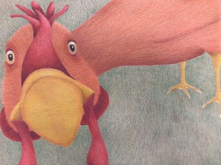
Final:
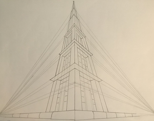
Perspective
|
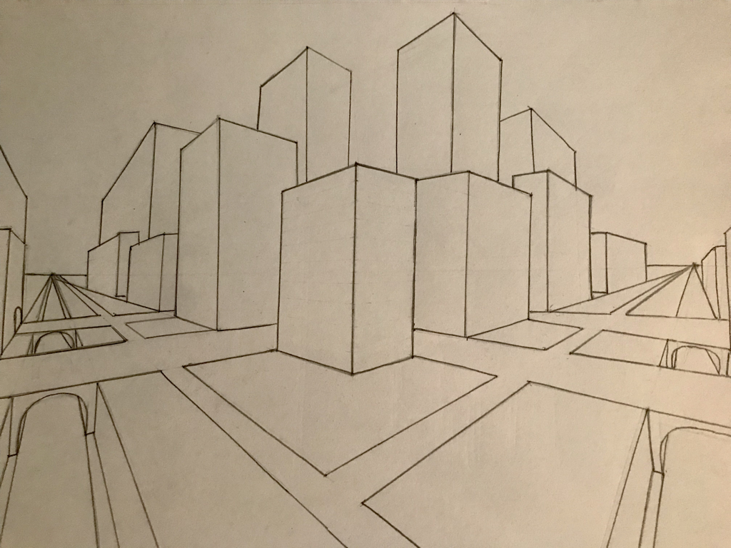
|
For all perspective drawings precision is very important. Having a single line slightly off can mess up an entire piece. This happened to me when I was making these. It was also difficult to follow along with the videos and to get my drawings to match his, so I had to improvise and do my own thing for parts of some of these.
|
|
|
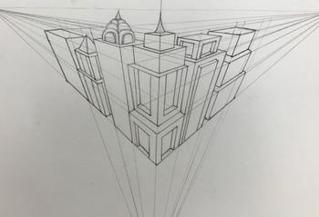
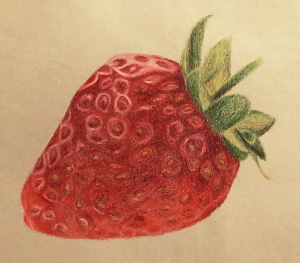
Fruit Drawing
Reference Picture
|
|
My strawberry looks much better than I initially thought it would, however it still has a lot of room for improvement. I think I did a decent job at pulling out colors that otherwise blended in, such as the orange and violet in the strawberry, and the yellows and browns in the stem. I also think the overall form of the both the strawberry and the stem looks good. It could be neater and I could have put more detail into the seeds, especially the ones around the center. I also could've matched the original better.
|
Prismacolor Practice
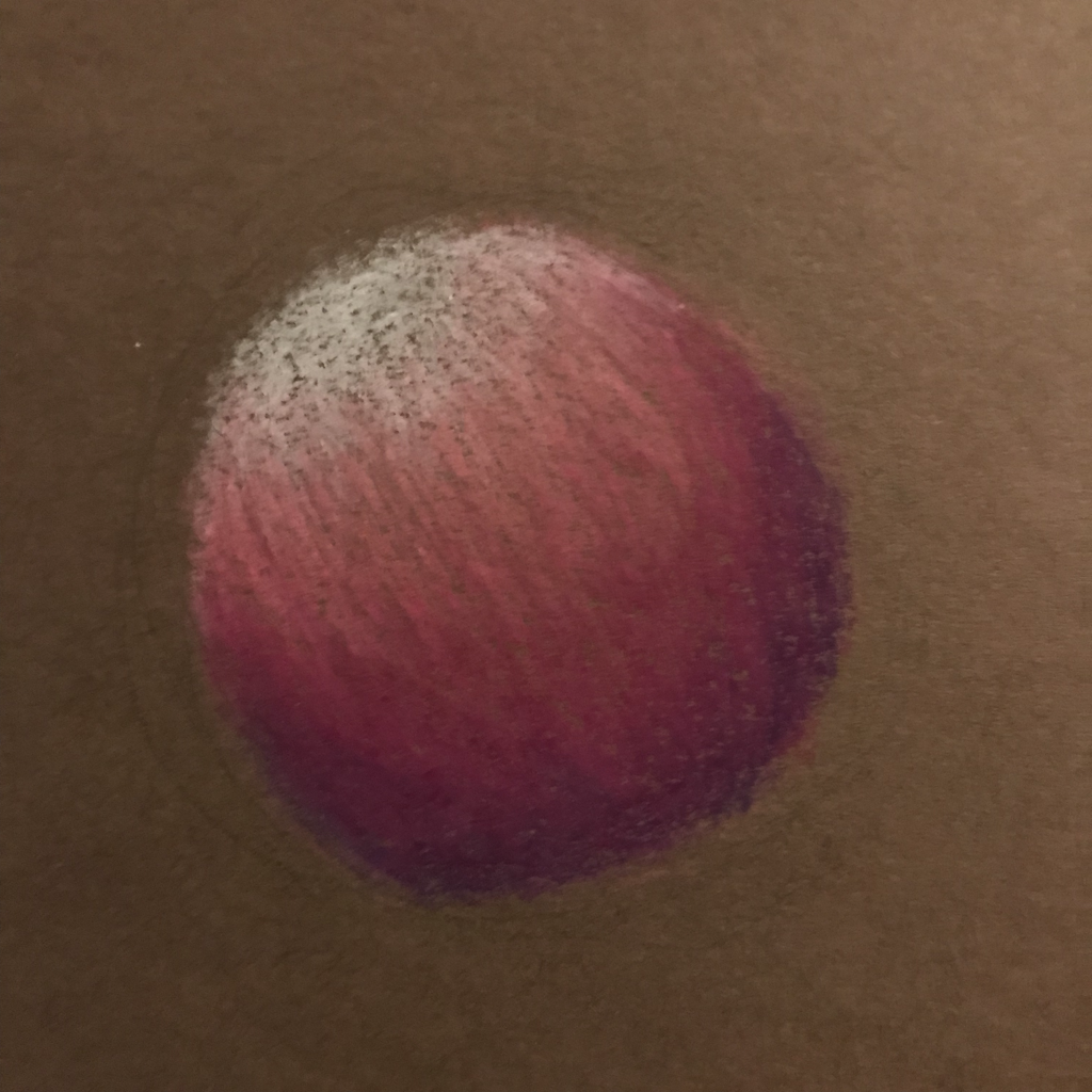
|
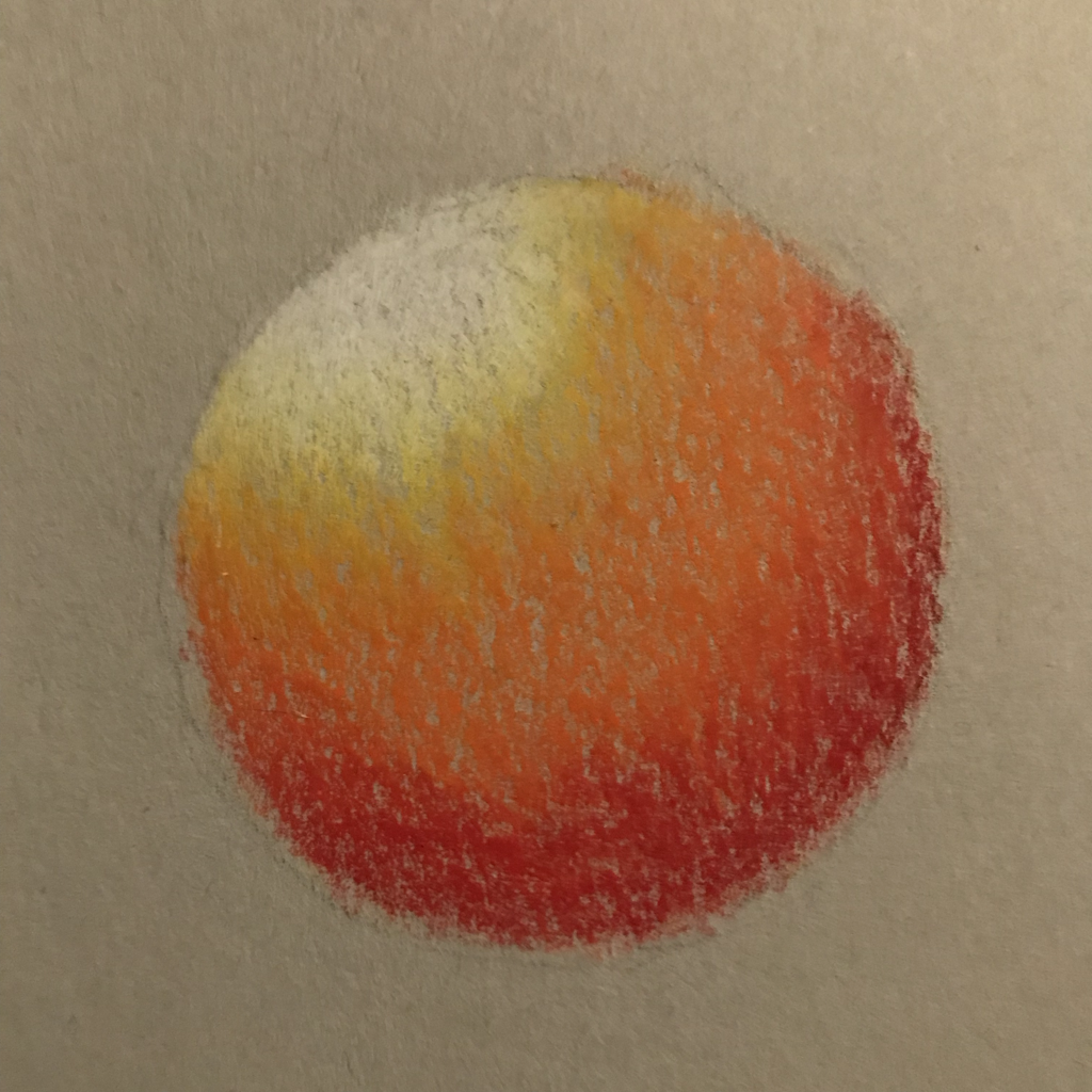
|
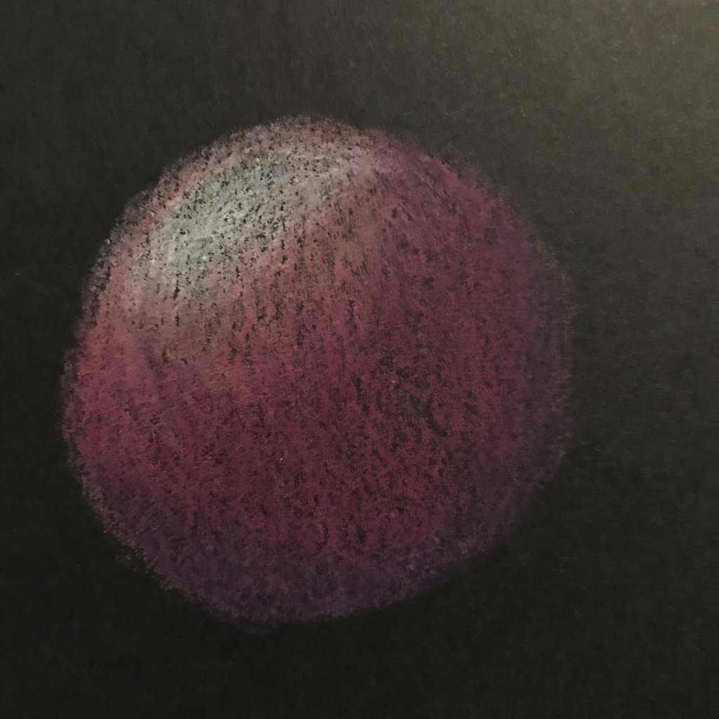
|
These are my Prismacolor spheres on black, grey, and brown paper. I learned that your choices of color have a large impact and that it's difficult to make spheres look round; you have to shade in a certain way and have a certain balance of each color.
|
White Color Pencil Practice
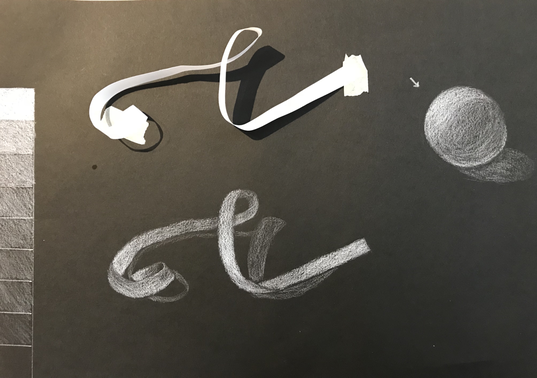
|
When using regular pencils on white paper you focus the shading in on the darks and use less pressure for the lights. When using white pencil on black paper you have to think in reverse, which is hard to get used to. I think my value chart is decent, however some of the medium values aren't very distinct from each other. My ribbon looks okay. I could have left a few areas more dark and lifted the highlights more. The sphere isn't that great. It doesn't have the wide range of values needed to make it look round.
|
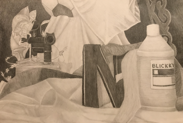
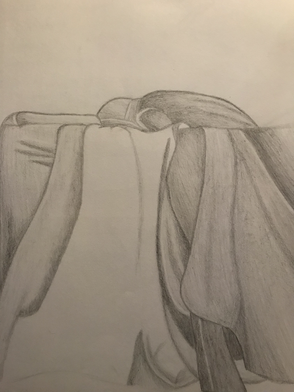
Still Life Drawing
|
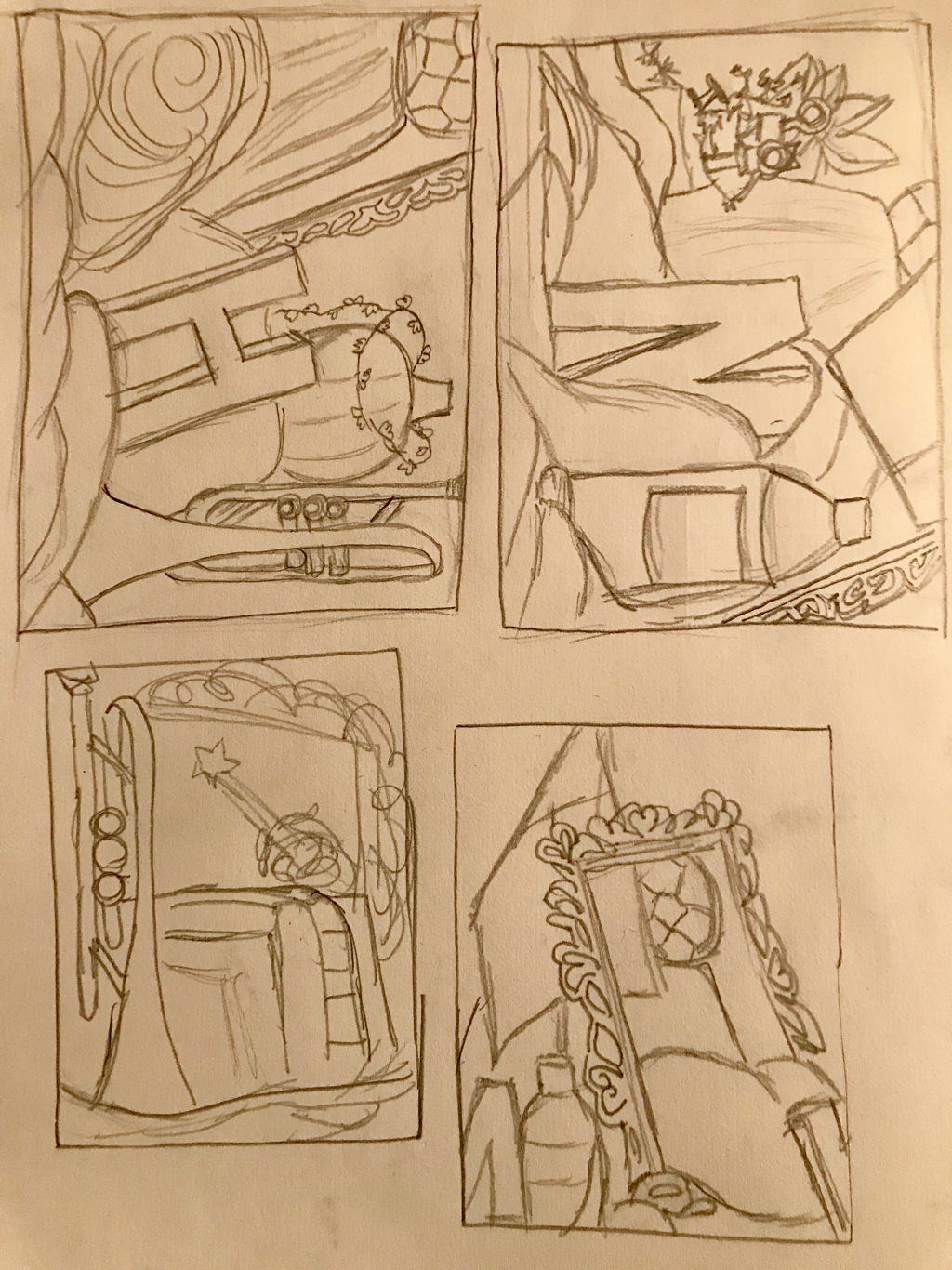
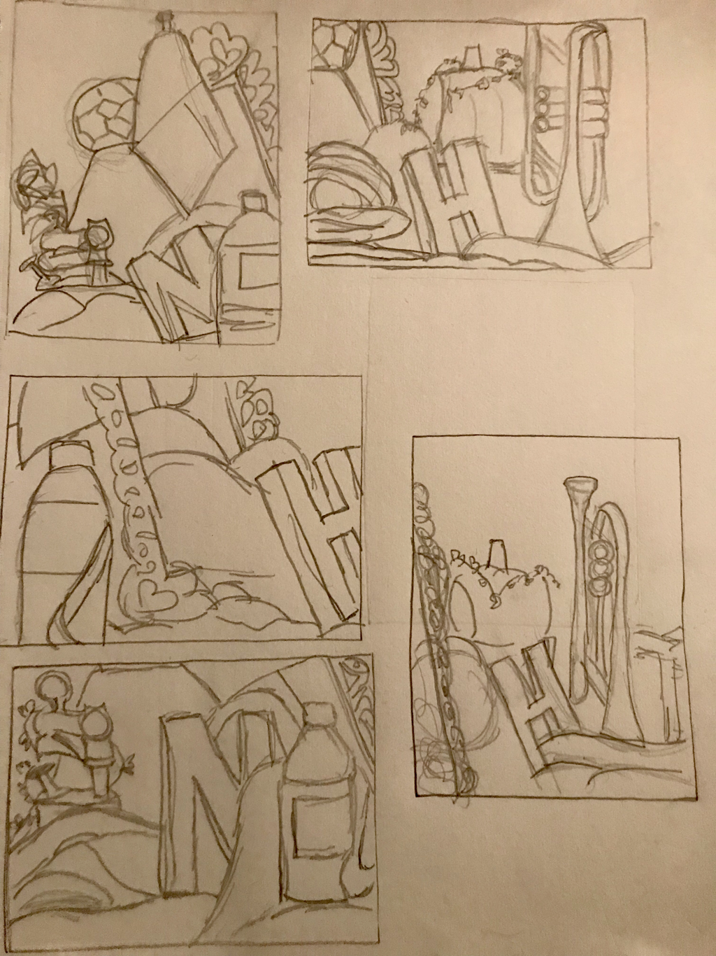
Composition Sketches:
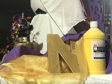
Photo of Still Life:
In-Progress Pics:
|
1. Describe the craftsmanship of your drawing. (Is it clear, clean edges, blended well, smudges, defined space, etc.) I think the overall craftsmanship of this piece is pretty good. My shading is even and neat and most of my lines aren't really visible. There's clear definition between different things. I do have few smudges, however they're not that visible and, thus don't take away from the overall drawing.
2. Are your values and shadows realistic? How many values did you include? How and why are values important? A few values are darker or lighter than they should've been, however a lot of them match up nicely. I think I used a wide range of values. Values are important because they show dimension and create contrast. 3. Is there a clear source of lighting? For the most part the light source is discernible: I used shadows to show where the light was coming from and kept them consistent throughout, however I still could have done better. 4. How important were the compositional sketches? The compositional sketches were important towards determining what portion of the still life to draw for the real thing, as they showed which objects looked good together and how much I should zoom in. 5. How is your final drawing successful? My drawing resembles the real thing, has a nice amount of contrast, and utilizes a wide range of values. 6. Are the proportions, structure and perspective of the subject correct? For the most part these are all correct. A few things ended up being a little off compared to real-life, being smaller or larger, or narrower, than they should have been. For the most part its relatively clear about which objects are in front of/behind each other and most of my piece looks three-dimensional, however a few things fell flat: the frame and the pinwheel in particular. The shape of the paint bottle is also a little off. 7. Does the placement & grouping of objects create a pleasing arrangement (composition)? The way each object was placed in the overall piece created a complete, successful composition. 8. Is there a center of interest and is it well located? I think the N is the center of interest, as its dark value contrasts greatly with the light values around it and it's centrally located in the foreground. I could have followed the rule of thirds, however, to make it stand out more. 9. How well did you manage your time and resources throughout the process of creating this drawing? Do you see where you could improve in this area? This took me a really long time to create. For this drawing, and future ones, I need to learn how to work a lot more quickly and efficiently. 10. What challenges did you encounter during this project and how did you overcome them? Drawing the fabric and discerning details was difficult. I tried to work carefully and thoroughly to overcome these. 11. What have you learned drawing a still life? I learned a lot about creating a cohesive piece with a pleasing composition and the importance of highlights and shadows in making objects look more realistic. |
Final:
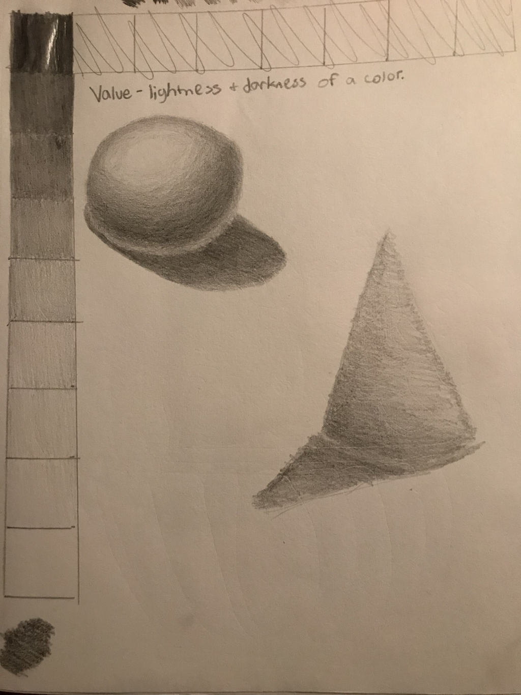
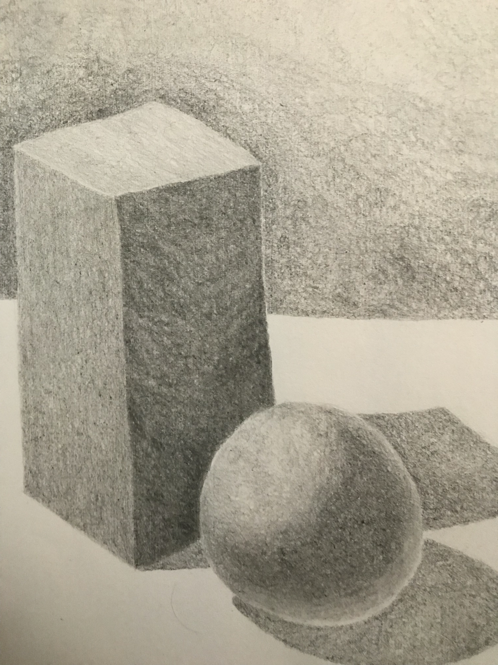
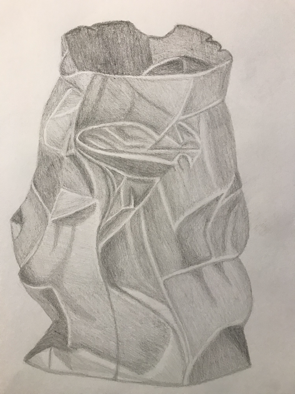
Value Chart, Forms, Paper Bag, and Fabric
|
|
|
|
Value Chart: The most difficult aspect of this was only being able to use a 2B pencil for all of the values. It was hard to get the darker and lighter values and also create a clear difference in the values, however I still could have done better, especially since the lighter values ended up having practically no variation.
Forms: For this activity I practiced shading using circles, which actually worked relatively well. It was useful for keeping my values even, particularly in the rectangular prism, and creating smooth value changes, as in the sphere. In the background, however, I didn't execute this method as well, so the values are kind of uneven and the they don't transition as well. Overall my proportions and values turned out nice and the light source is clear. I think the sphere was executed really well, especially compared to the previous one I did with the value charts. It has nice transitions in value and looks rounded and spherical. I did go a little bit overboard with the reflective light.
Paper Bag: It looks like a paper bag, so that's a start. I was also able to make it look relatively three-dimensional, but in more of a way that resembles Cubism. That's because I made the mistake of mostly using separate, solid chunks of value to show the crinkles in the bag. The bag also needs more shadows and more darker values.
Fabric (didn't finish): I ran out of time in class and then my stupid self didn't think about taking a picture for later, so it's not finished. I think it was going in the right direction. Opposed to my paper bag I mostly used value transitions instead of solid blocks of value to show the folds in the fabric and make it more three-dimensional, however it still could be improved.
Overall these activities allowed me to practice and get used to using pencils, creating value changes, and drawing from life.
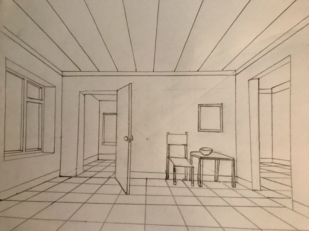
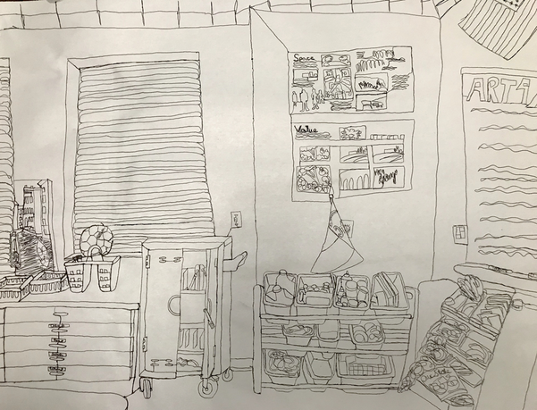
Contour Room Drawing
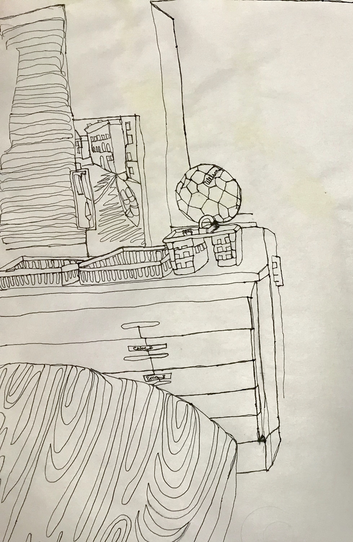
Practice
|
1) Did you use a fluid line? Explain how this is evident. Everything was done using a single line, so I did use a fluid line, however at some points it got a little sketchy, or I paused for too long over a certain spot and created a blotch with the ink, making the "fluid" part of my fluid line kind of questionable.
2) Explain how your knowledge and creating practice studies with contour line contributed to the success of your piece. The practice activities we did ahead of time enabled me to learn about and practice creating contour drawings ahead of time, allowing me to get used to using a single, fluid line to draw. 3) Describe the difference in your contour line drawing to an outline drawing. With an outline drawing you only focus on the outline of shapes, not the contours or the textures of anything, and you have the ability to draw the outlines of things first and maybe fill them in later, whereas with a contour drawing you draw everything as you get to it and don't go back later. 4) Explain how your interpretation of line is essential in capturing the look of the room. It's important because the line that you draw is supposed to encompass everything you see, which is important to capture the look of the room. 6) What did you learn from completing this drawing? If you could recreate your piece what would you do differently to enhance the final outcome? I learned that it is possible to only use one line to draw something, regardless of its level of complexity, and that when creating a contour drawing it is important to take your time and create smooth, fluid lines. If I were to do this over again, I would put more time and effort into making my lines neater and more even and I would do a better job at proportions. |
Final:
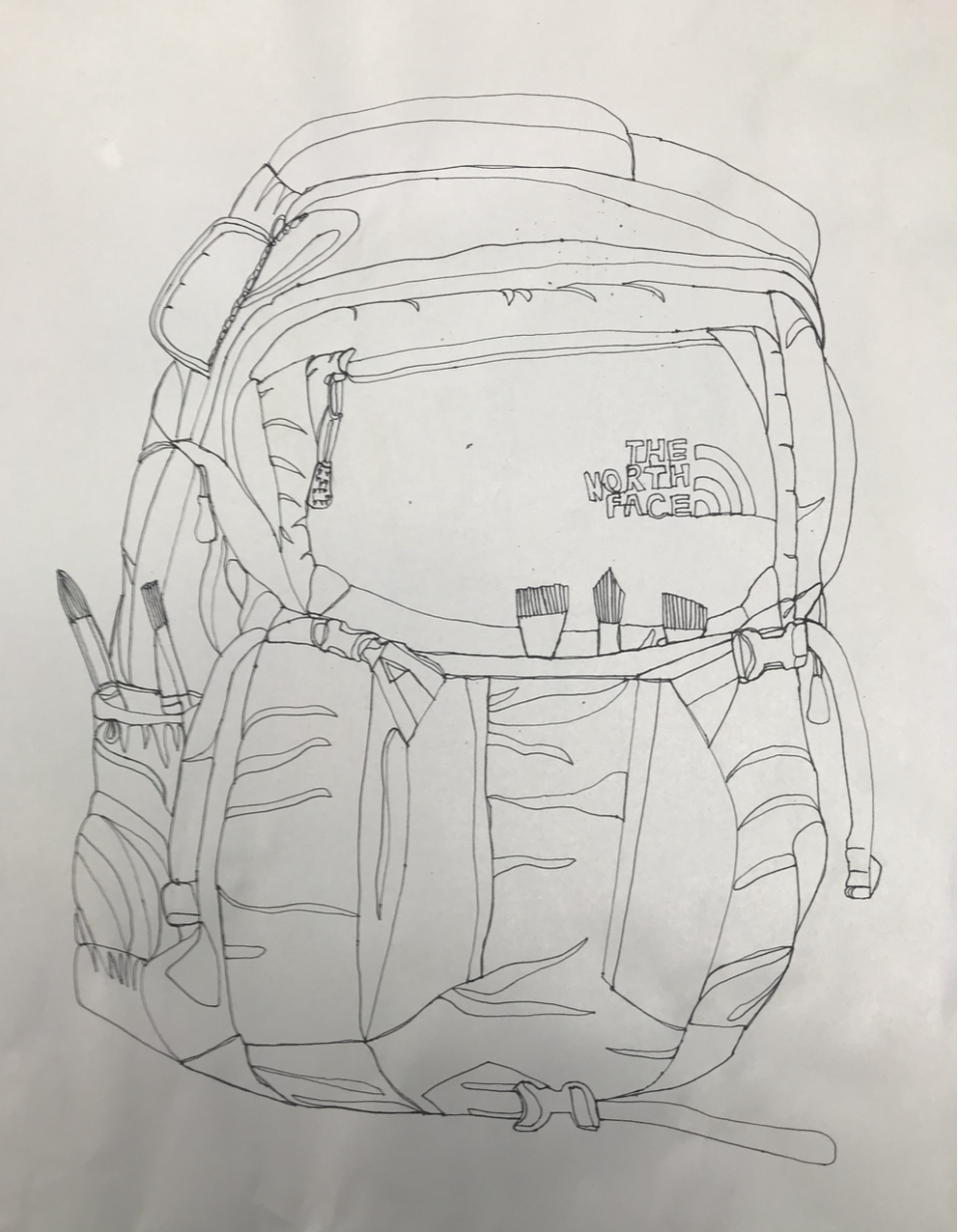
Shoe and Backpack
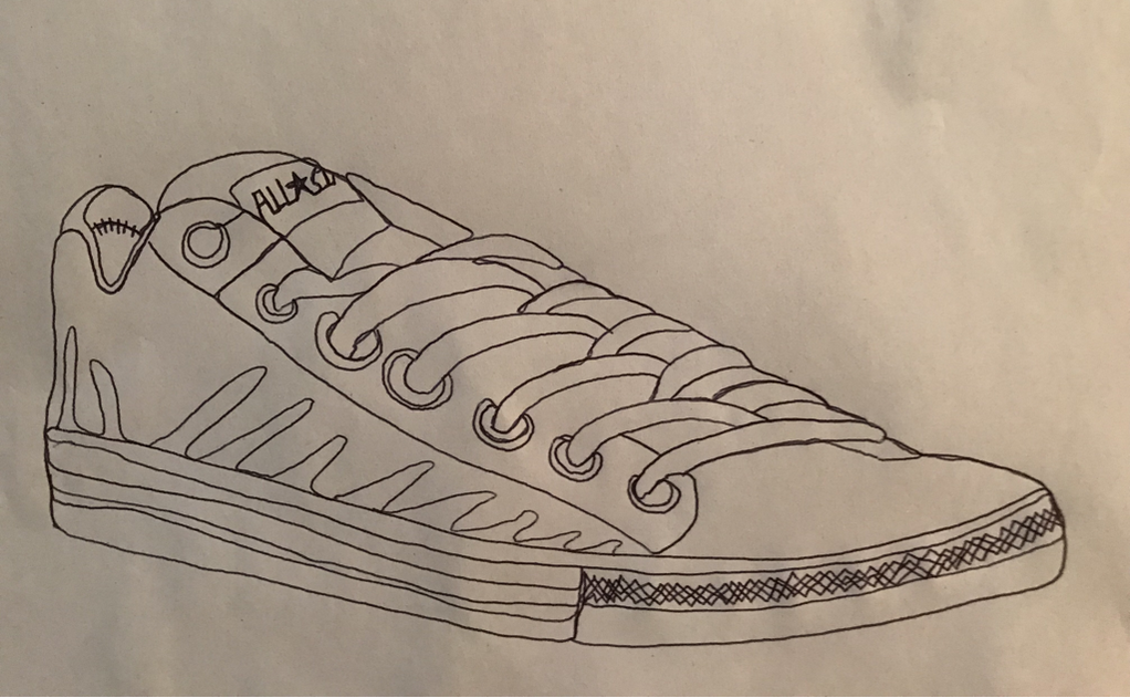
Shoe - I could have slowed down and been a lot neater with my shoe, especially around the laces and the top of the shoe. What I like about it is I was able to make it with one fluid line that didn't have a ton of bump from where I paused for too long. I guess that's the advantage for doing these quicker.
Backpack - As I was drawing this I wasn't sure about how it was going to turn out, however it ended up looking pretty good. It actually looks like a backpack and for the most part I got the proportions correct. I wish it could have been a bit neater and more detailed. |
|
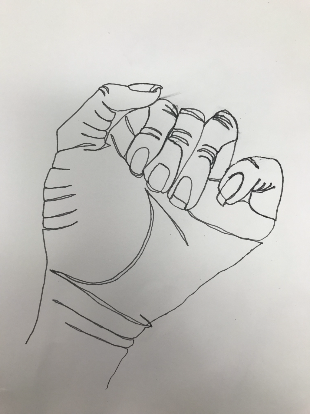
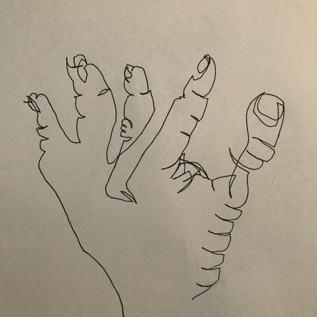
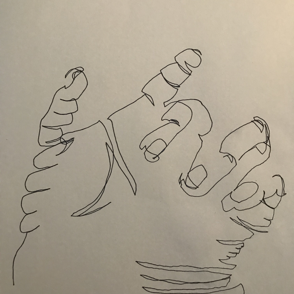
Modified Contour Drawings
|
|
|
Because we could actually see these they’re supposed to be much better than the blind drawings, however mine aren’t that much better. My first one I did a relatively good job at, up until the end when it became really weird and and caused the entire thing to appear as if it was a blind drawing. Like the initial blind drawings I think my second one ended up being the best, however the proportions are still off, especially around the pink finger, and it could use more detail. The third one is just okay. I think I essentially have fingers down, it’s simply connecting them into a hand that looks nice that’s still difficult.
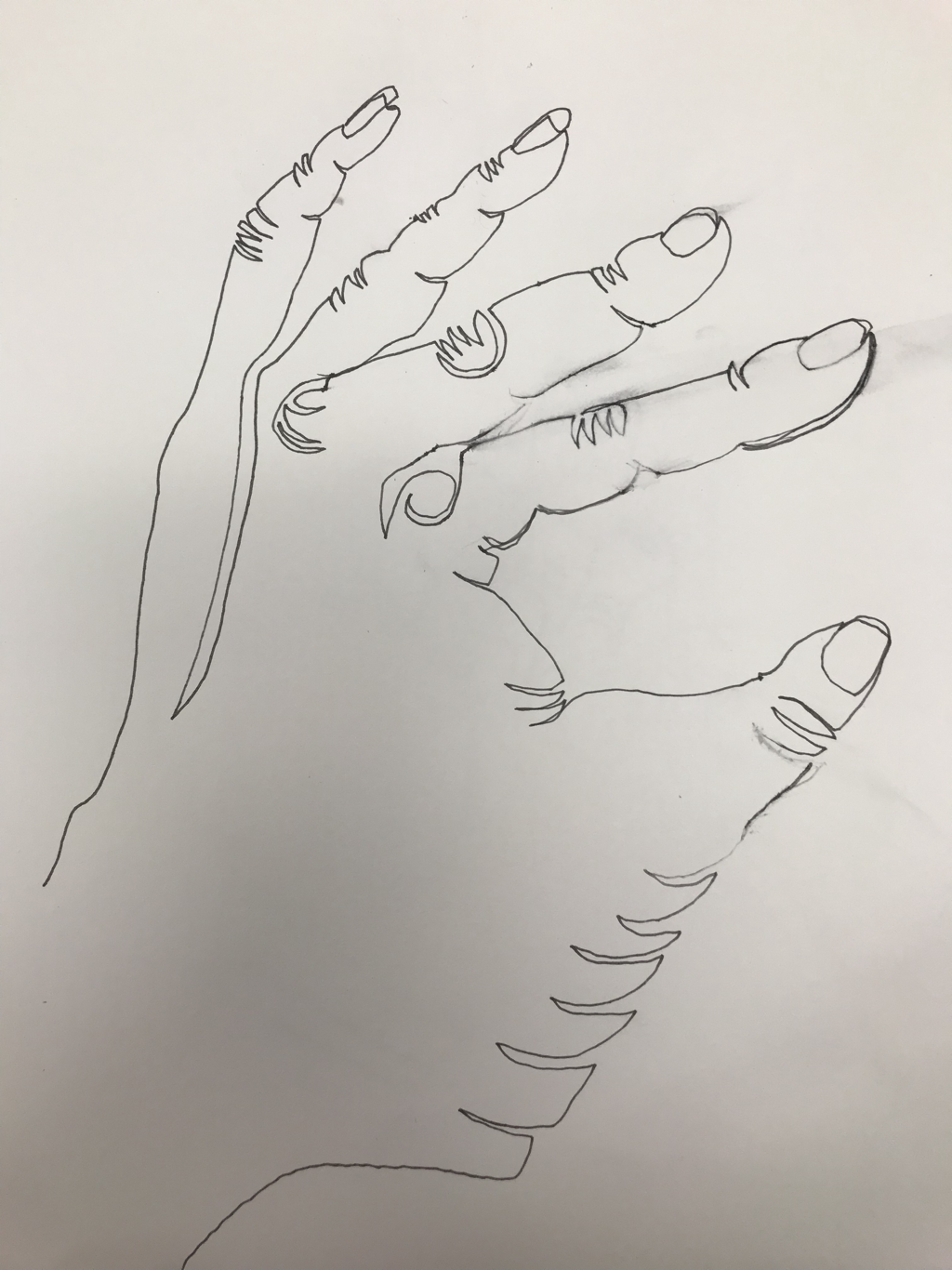
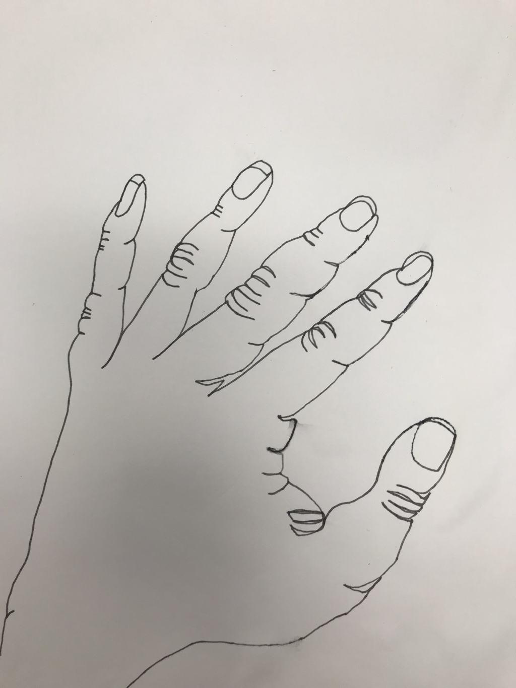
Blind Contour Drawings
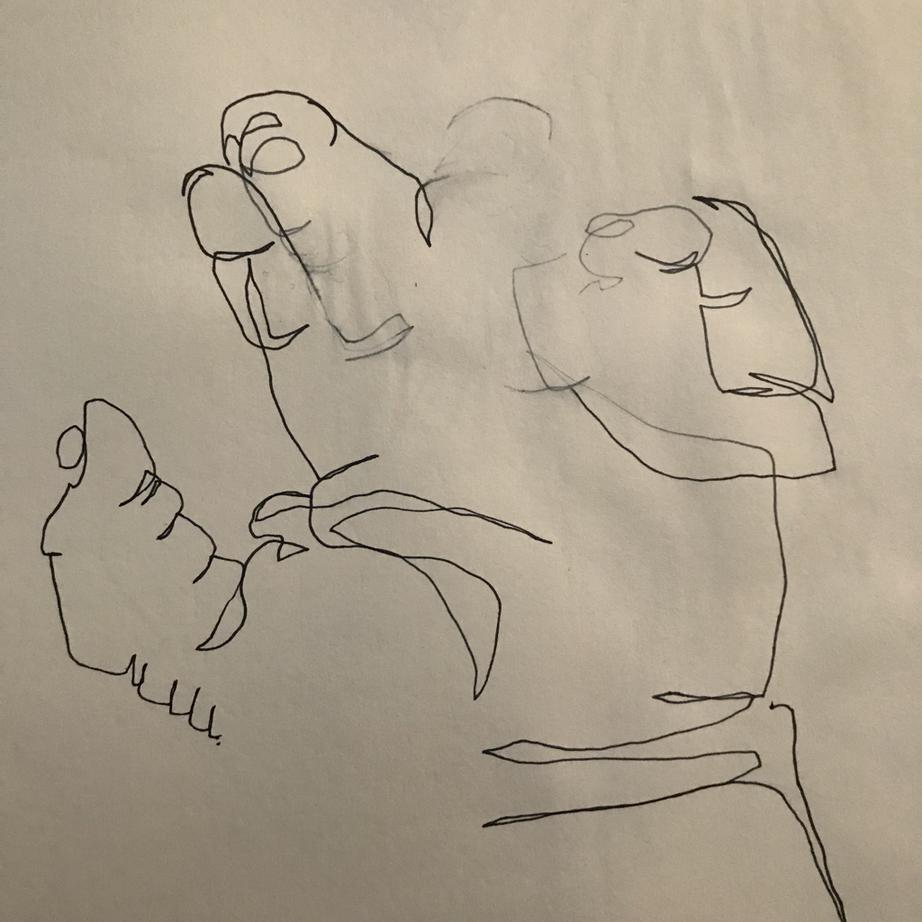
Blind Contour #1
|
Blind Contour #2
|
Blind Contour #3
|
Doing this activity was a brand new experience for me; I’ve never done contour drawings before, let alone blind ones. During my first drawing holding my other hand still caused my hands to sweat, creating a gap in the drawing. Otherwise it’s not that bad. It could use more details (all three of mine could use more details; I went too quickly when creating them), however it’s almost exact to the size of my hand. My third one was better with the details and the contours than the other too, however the shape was partially lost and it ended up being too large. I feel like my second drawing was the best out of the three: it had a relatively nice balance of shape, size, and detail. Overall I should have taken more time to complete these, and of course practice would help me improve.
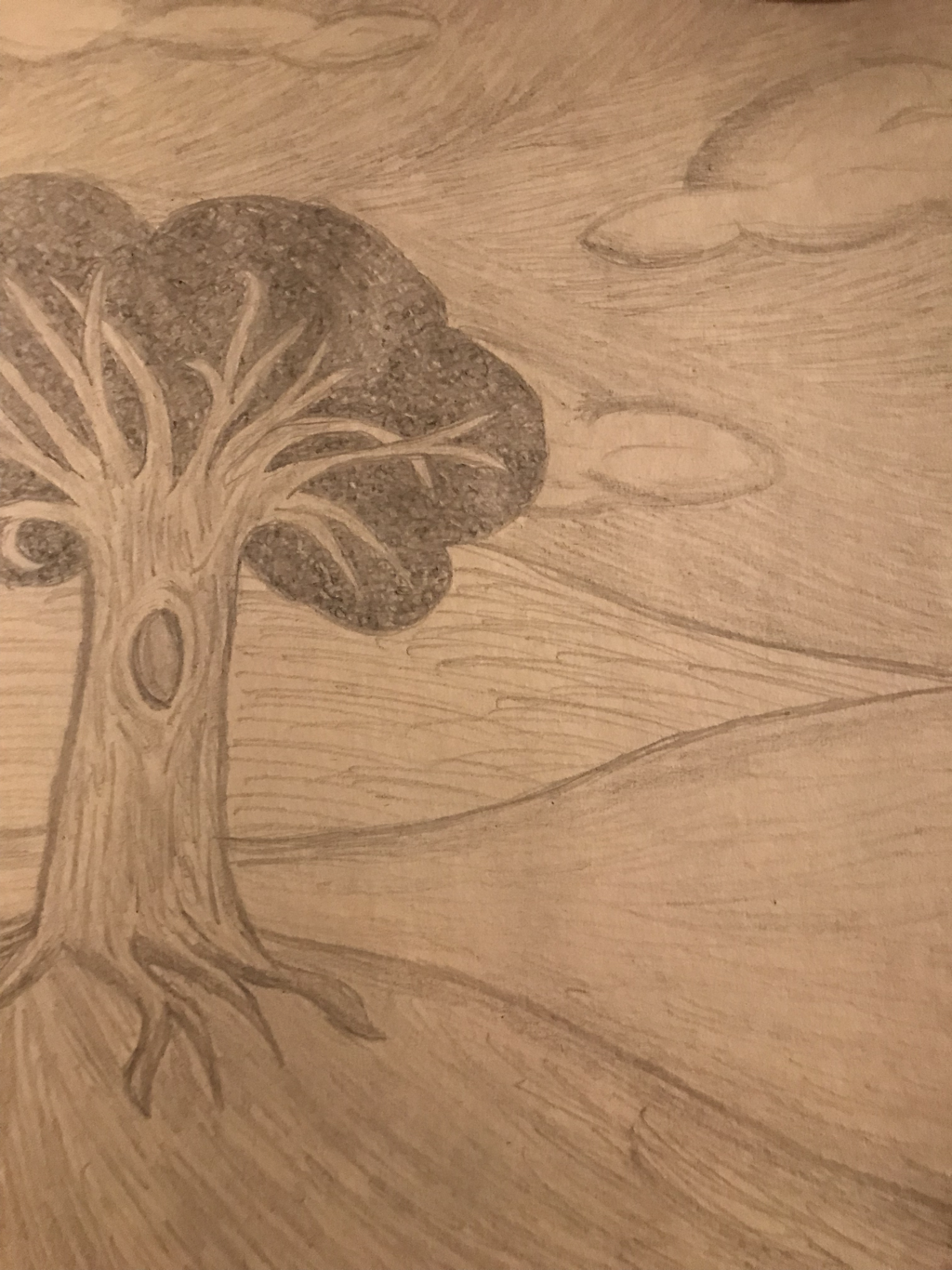
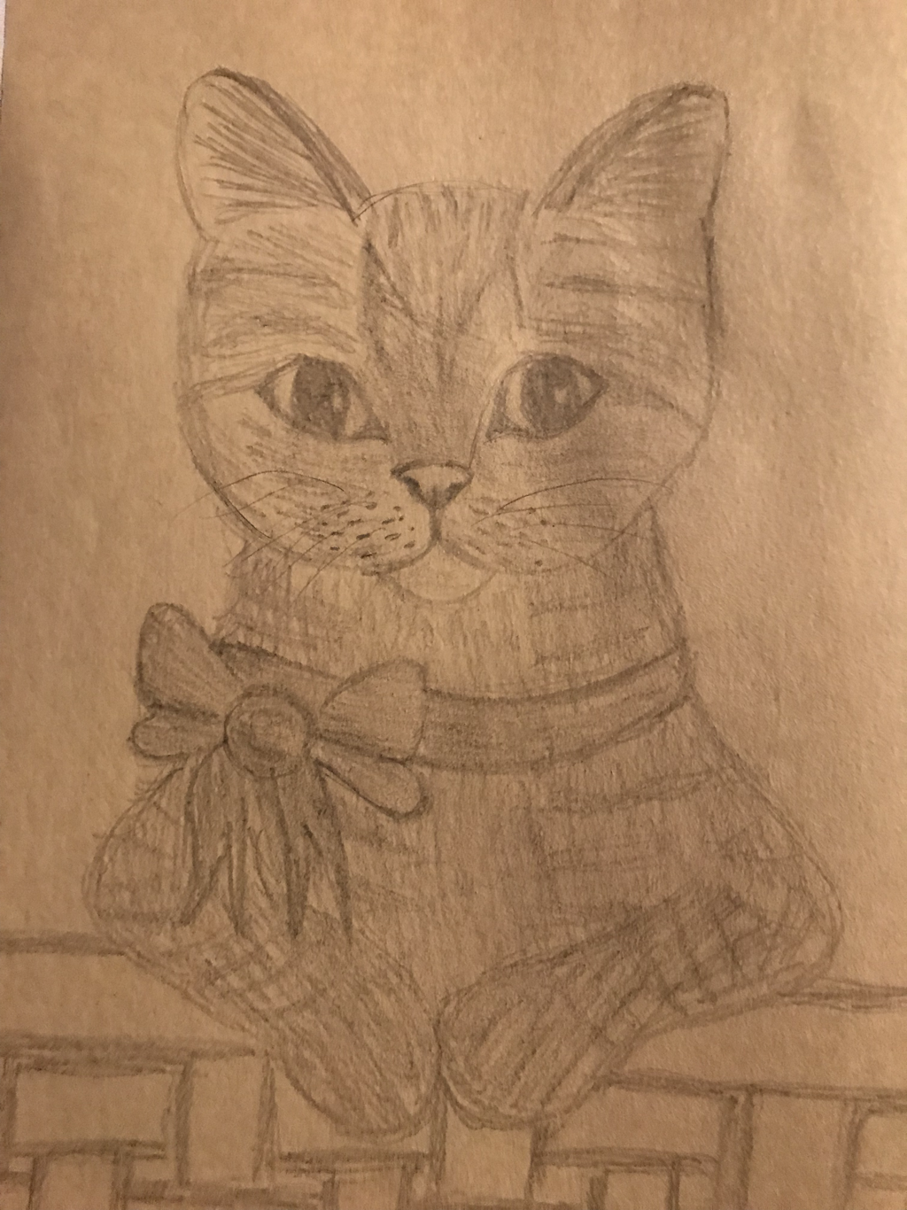
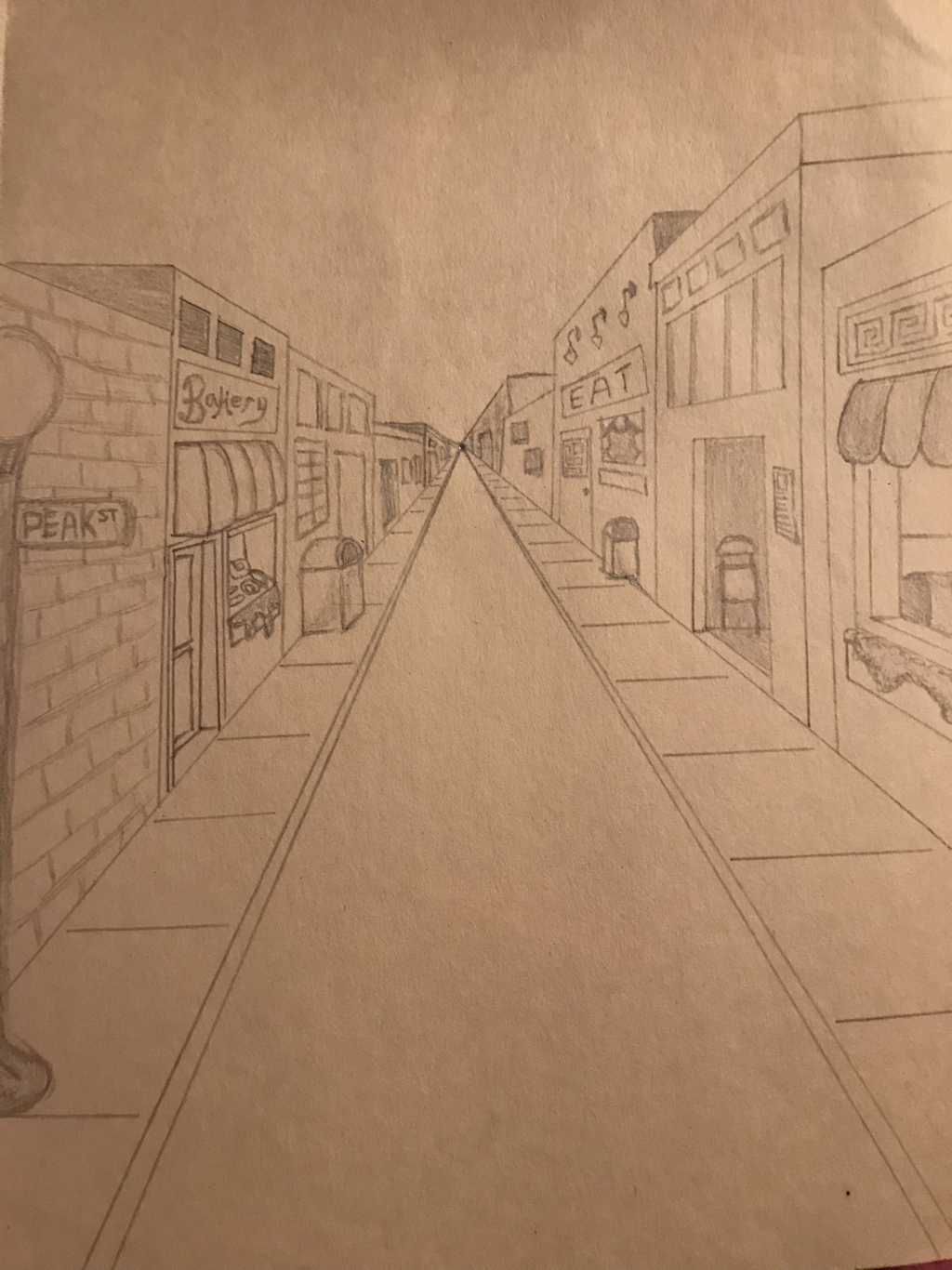
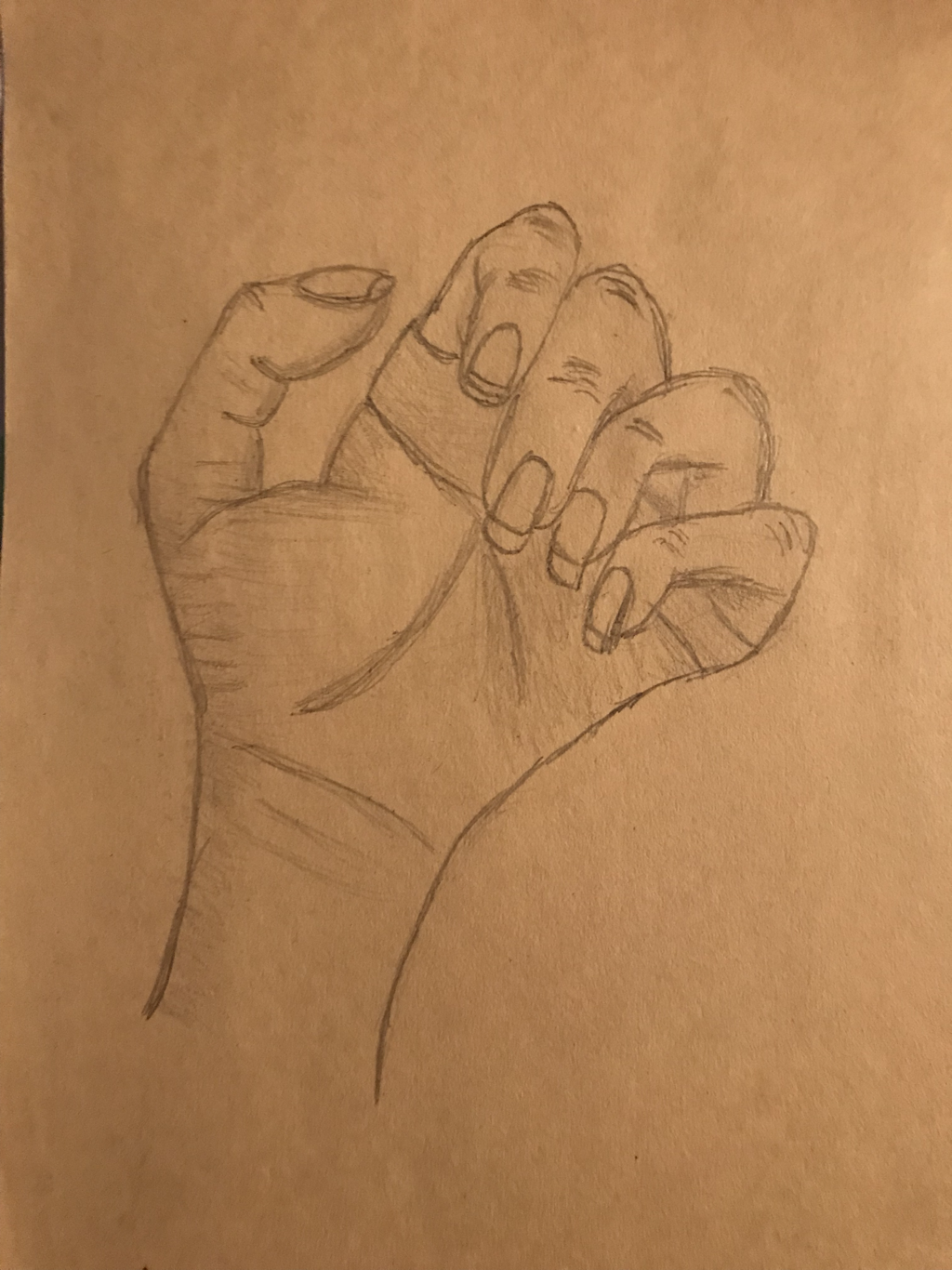
First Day Drawings
|
|
|
|
Tree in a Landscape - I think the tree looks really good, especially compared to the one I did in Art 2. The background is the part that’s a little lacking (it could use more depth and detail and be neater), but then again it is the background.
Animal - The cat doesn’t look bad, it’s just a little a flat and cartoonish. It could use more detail and more value.
Street scene - I probably could have chosen a more interesting composition, however I think did a decent job with the details and the perspective. Normally I struggle with perspective, however this came out relatively well.
Hand - I think I did a pretty well with the value and the lines within the hand, however the shape ended up being strange. Overall it’s not that great when compared to other hands I’ve done in the past.
Photo used under Creative Commons from www.holgersbilderwelt.de
