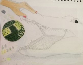
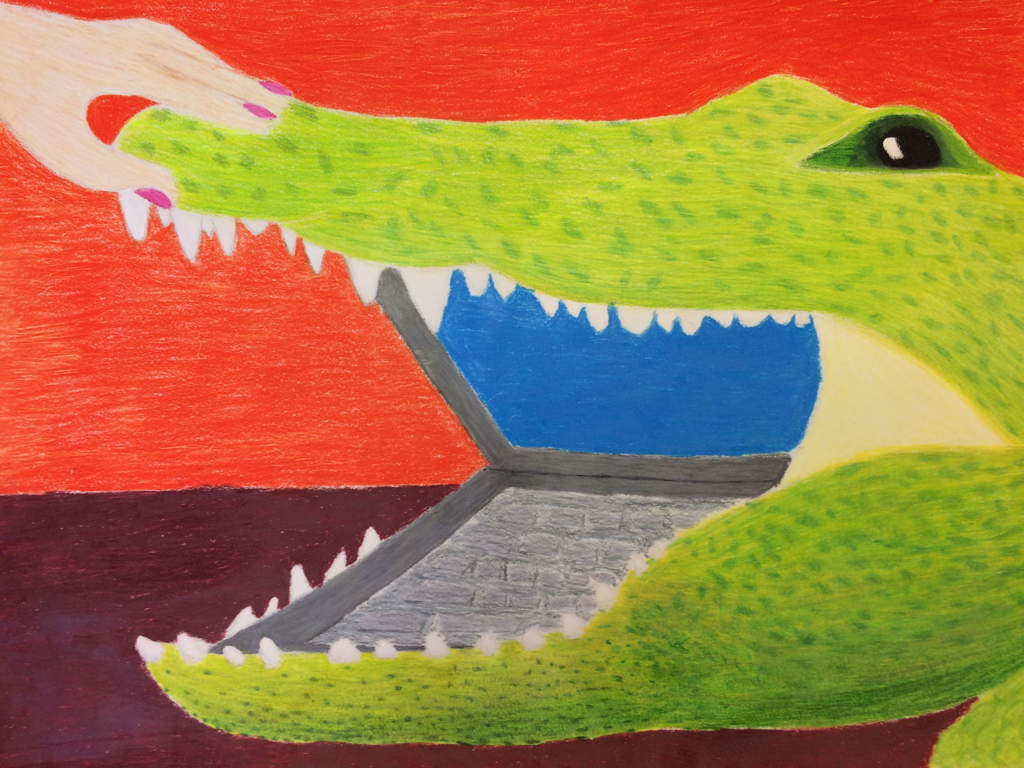
 1) I chose to use color pencil because I like the way you can layer different colors and I thought that the texture created by them kind of looked similar to a crocodile's skin. I also liked the vibrant colors that they created.
2) I added together a crocodile and a laptop computer. I thought that the way the crocodile's mouth opened and the way the laptop computer opened was similar and went together nicely. 3) My process: First I found reference photos of a crocodile and a laptop. Then I made a sketch of what I wanted to do and experimented with the different ways I could make colored pencils look like crocodile skin. Then I began my final project. First I drew out my piece based on the sketch. I made the crocodile's shape first before inserting the computer part and the hand. I started filling in the crocodile first, (slowly) layering on different shades of green and yellow, and in some places black and gray. Then I filled in the hand by layering pink, light brown, and white. Lastly, I filled in the laptop part, layering on different grays and blacks and blues before filling in the background to finish.
0 Comments
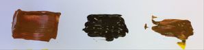
I thought that the color swatches were actually the most helpful warm-up. It was fairly difficult to make the color swatches, as they were hard to get right on the pallet and from there the colors looked a lot different on paper. In order to make the color brown I mixed all three primary colors together in about even amounts before adding a little more of a particular color and/or white or black. 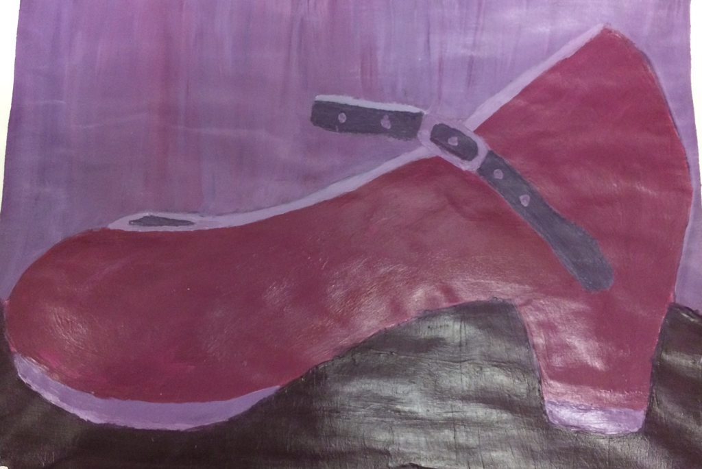 I chose to paint a tap shoe because its personal to me and I also liked the shape of the shoe for painting.
Pencil Drawing  Pros: The pencils were definitely the easiest when it came to creating different values. They were also fairly useful for creating texture and filling in details. Cons: There were many times in which it was hard to shade in an area without creating lines. Charcoal Drawing  Pros: Charcoal was really easy when it came to making darker values. Cons: It was super easy to smudge the charcoal and I had to repeatedly redraw my lines. Also, I felt that it was somewhat difficult to achieve a wide range of values. Pen Drawing 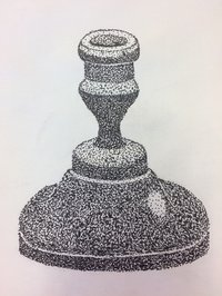 Pros: There was a surprisingly large range of directions you could go with the pen. Also, once it was finished it (the stippling, at least) looked really interesting. Cons: It was kind of difficult to create a range of values and to distinguish between parts that were dark, yet slightly different. Composition is the way in which the elements of a piece of art are arranged and Value is the different lights and darks within a piece of artwork. 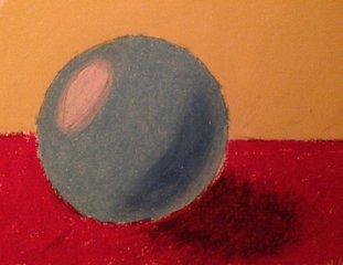 I thought that this was the most helpful warm-up because it reinforced the initial pencil sphere and what we learned about value and making spheres. Also, until this point no one had really showed me how to use pastels, so I did not like them, but now I want to use pastels in a future project.
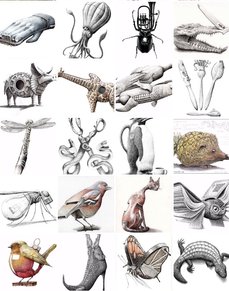
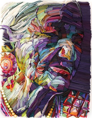
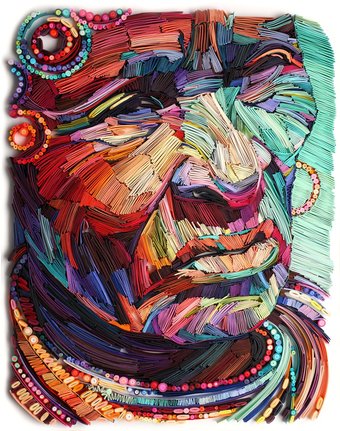
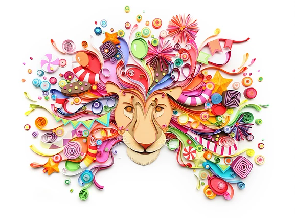 Yulia Brodskaya is my inspired artist. Yulia was originally from Russia but now lives in the UK. She started out doing graphic design and illustrations but is now a paper artist. She uses folded strips of bright-colored quilled paper fitted together to create her pieces. The reason I was inspired by her is that I love the bright colors and whimsy found in many of her works. I also love how some, such as the pieces below, look almost like paintings at first until you look closer and see the folded paper that makes them up. What also makes them neat, is up cose they're just folded up pieces of paper, but all together they form really interesting looking images. www.artyulia.co.uk/
|
AuthorWrite something about yourself. No need to be fancy, just an overview. Archives
June 2017
Categories |
 RSS Feed
